

Role:
Creative Director
Art Director
Product Designer
Product Manager
Retail Designer
Problem: The path to hearing aids is perilous (drama) for individuals 65+, there are too many steps and the lead time to clear hearing is at minimum a month long.
I'm spearheading Audicus' efforts to enhance accessibility and affordability of hearing aids. My role involves revamping the hearing test, developing a hearing aid simulator, ensuring brand cohesion, retail expansion and establishing design consistency across all platforms and mediums.
Target User
James is 65 - 70 years old and is a highly educated and a self proclaimed “researcher”. Our team interviewed over 100 customers and found that 60% are retired and 65% are males. Knowing this information, we knew that for most of our customers this would be their biggest purchase of their year and that they were trying to find the best deal for the highest quality.
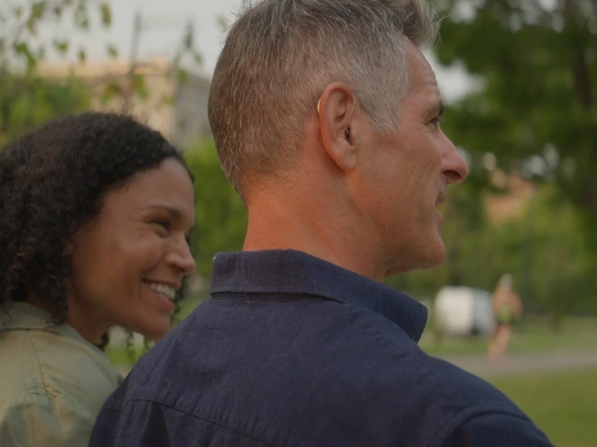
Oh, James looks young? When I was casting for our shoot, our exec wanted a non senior looking individual so here is James’ younger stunt double but it is a nice shot.

Projects
I have been very fortunate to get the opportunity to work on all these projects from scratch. I created the new brand and with that was able to build the entire design system that would transcend our website, hearing aid simulator, online hearing test and all of our supplementary materials.
The greatest challenge about working at Audicus is that the demographic has both auditory and visual needs, resulting in the need to invest in user research and feedback.
Brand Overhaul
Logo Design
Hearing Aid Simulator
Online Hearing Test
Instore Kiosk Design
Website Overhaul and Design

When I joined Audicus in spring of 2023, their brand was very elementary looking due to color and font choices, nor did they have any brand guidelines to adhere to. My first goal was to revamp the brand, ensure brand alignment across the org and create a consistent experience across B2B, B2C and retail.
Objective: Create a professional brand that increases brand recognition both online and in retail
Problem: The brand was reading less serious and lacked cohesion due to the lack of full time designer
Solution: Work with exec to create a brand that truly represents what we do here and to be taken seriously by perspective customers
Logo Redesign
Color/font/imagery
Voice
Brand Book/Guidelines
Implementation of new brand
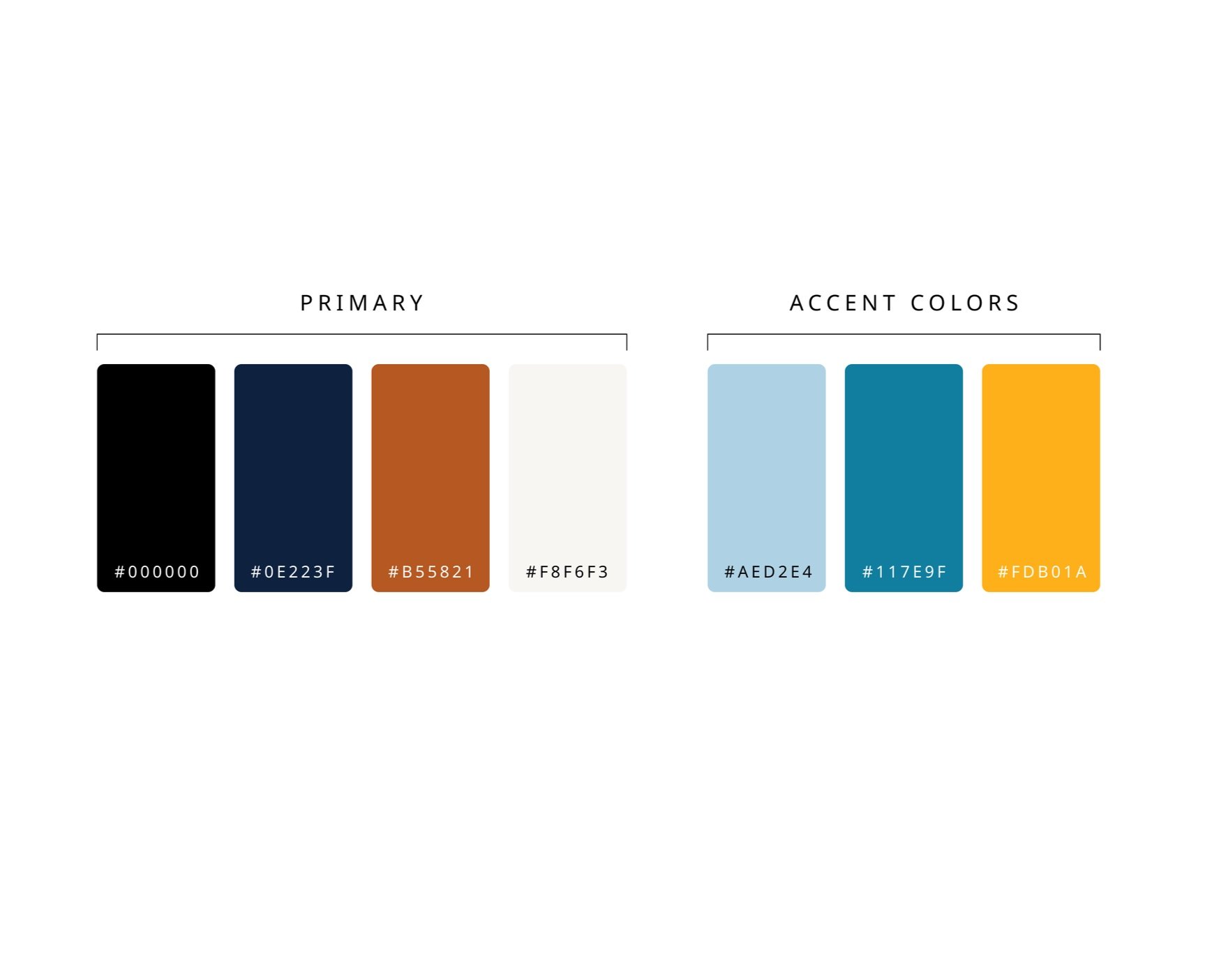
Color Palette
I chose a more mature palette during my brand overhaul because from user research we learned that people were confused by our brand due to the bright colors and elementary font choices, it didn’t feel professional or medical.
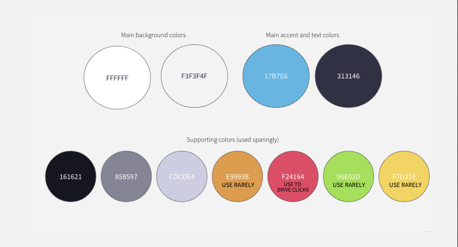
the old brand colors
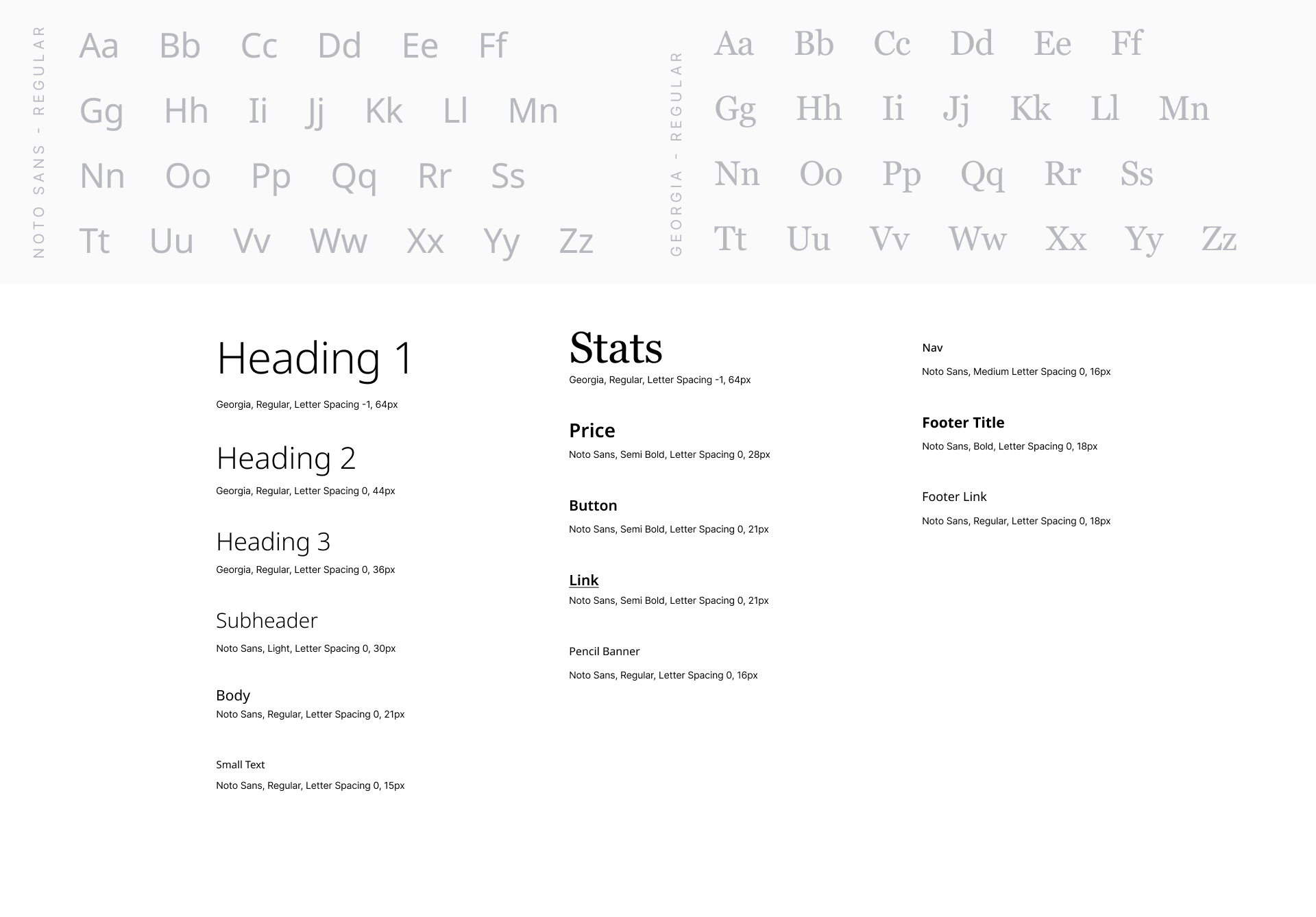
Typography
The old website used a “bubbly” (for lack of a better descriptor) serif as their primary font which didn't read very tech-y or medical so I switched it over to a sans serif that is highly legible and more on brand with our company. It is important to note that this demographic not only has hearing impairments but visual impairments as well.
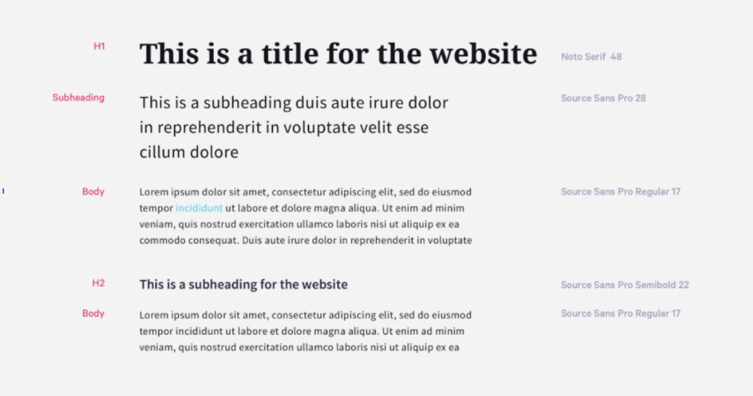
the old font guidelines
Environmental Photography
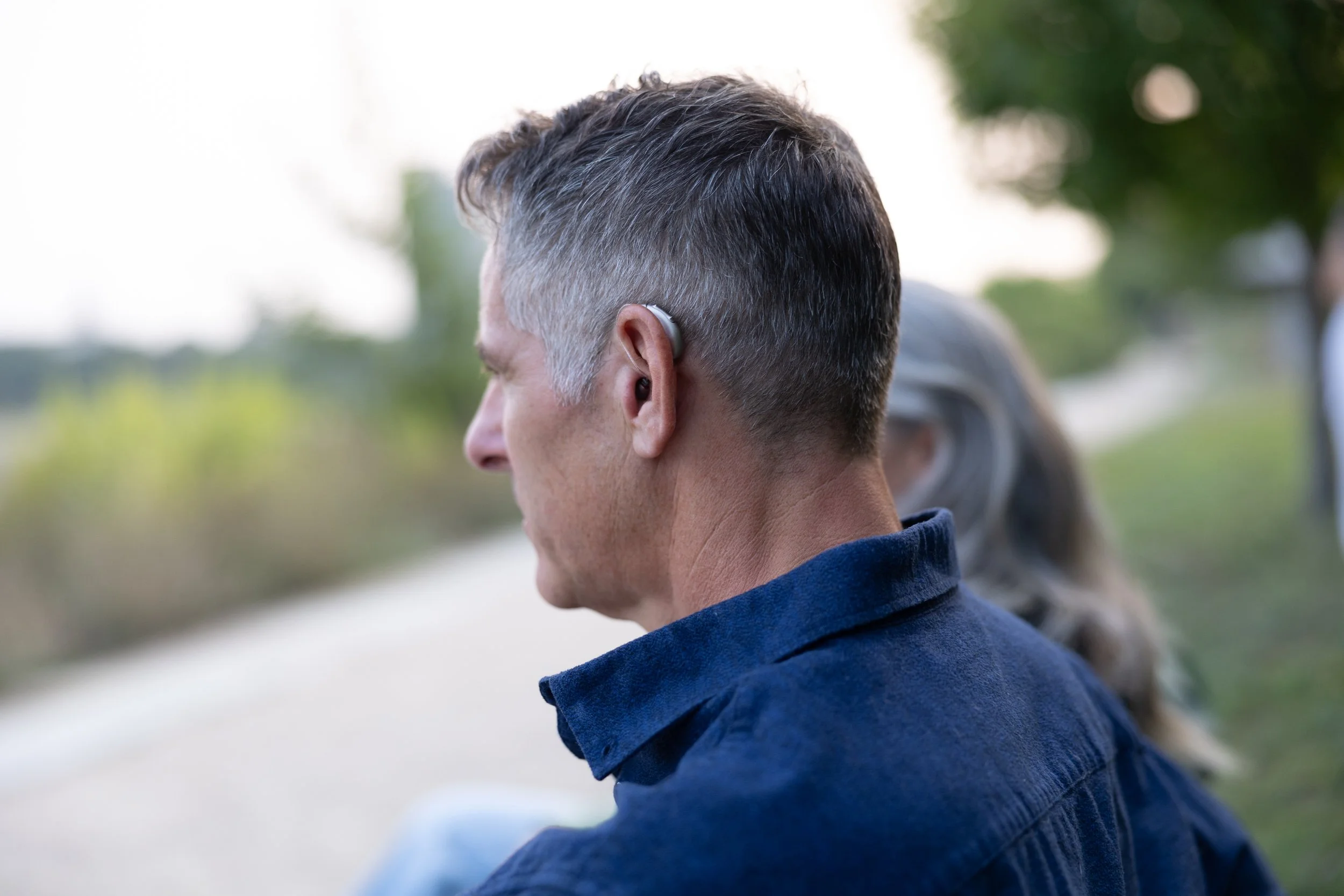
I was fortunate enough to get to creative direct a shoot to switch over our environmental shots. I have learned from working at Audicus that customers want to see how subtle the hearing aids look and where they can go with them. This is a big departure from our old creative direction which was trying to show that hearing aids can still be “sexy”.
Hearing loss is an emotional loss. It affects every part of your life and reduces the joy that you once found in the little moments.






Product Photography
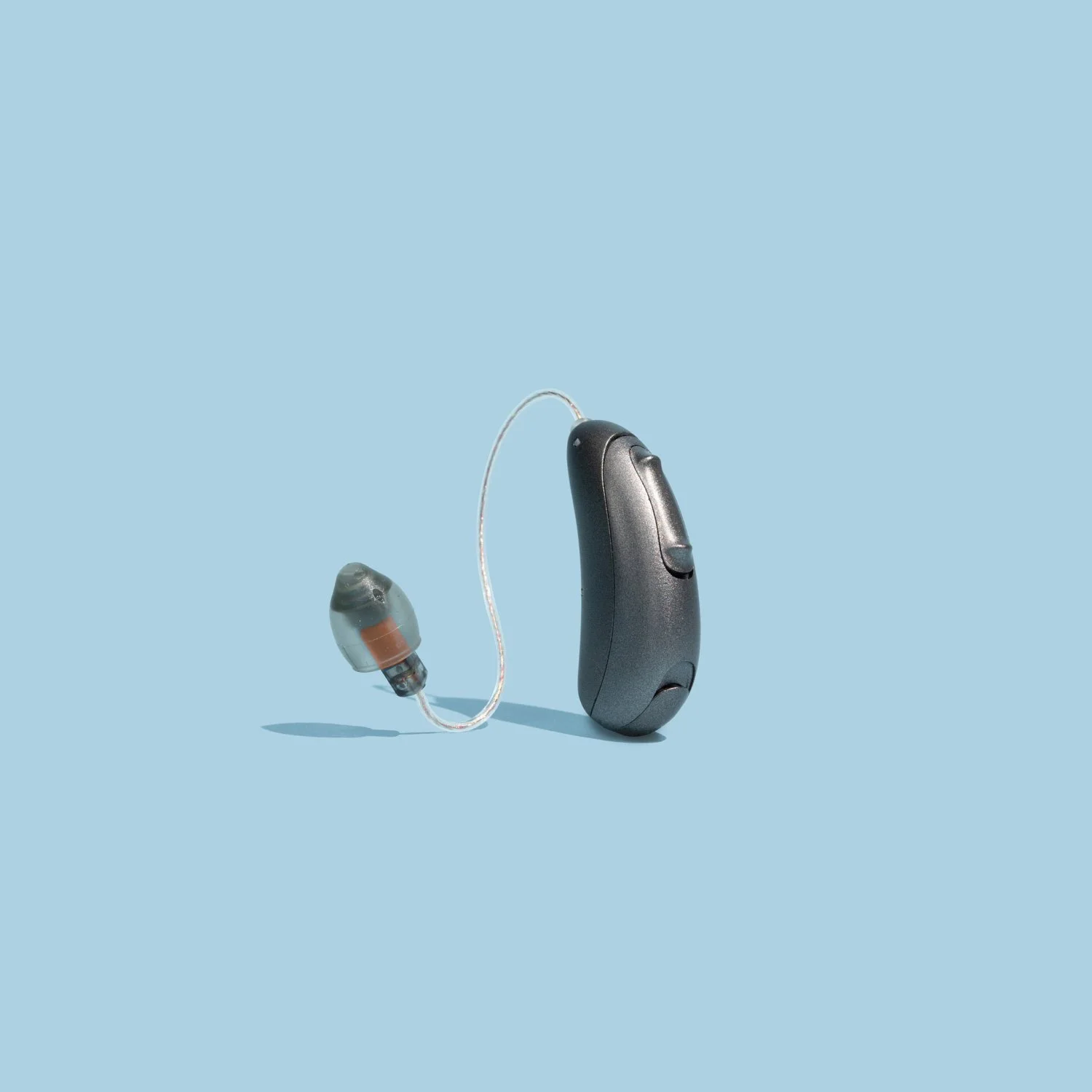
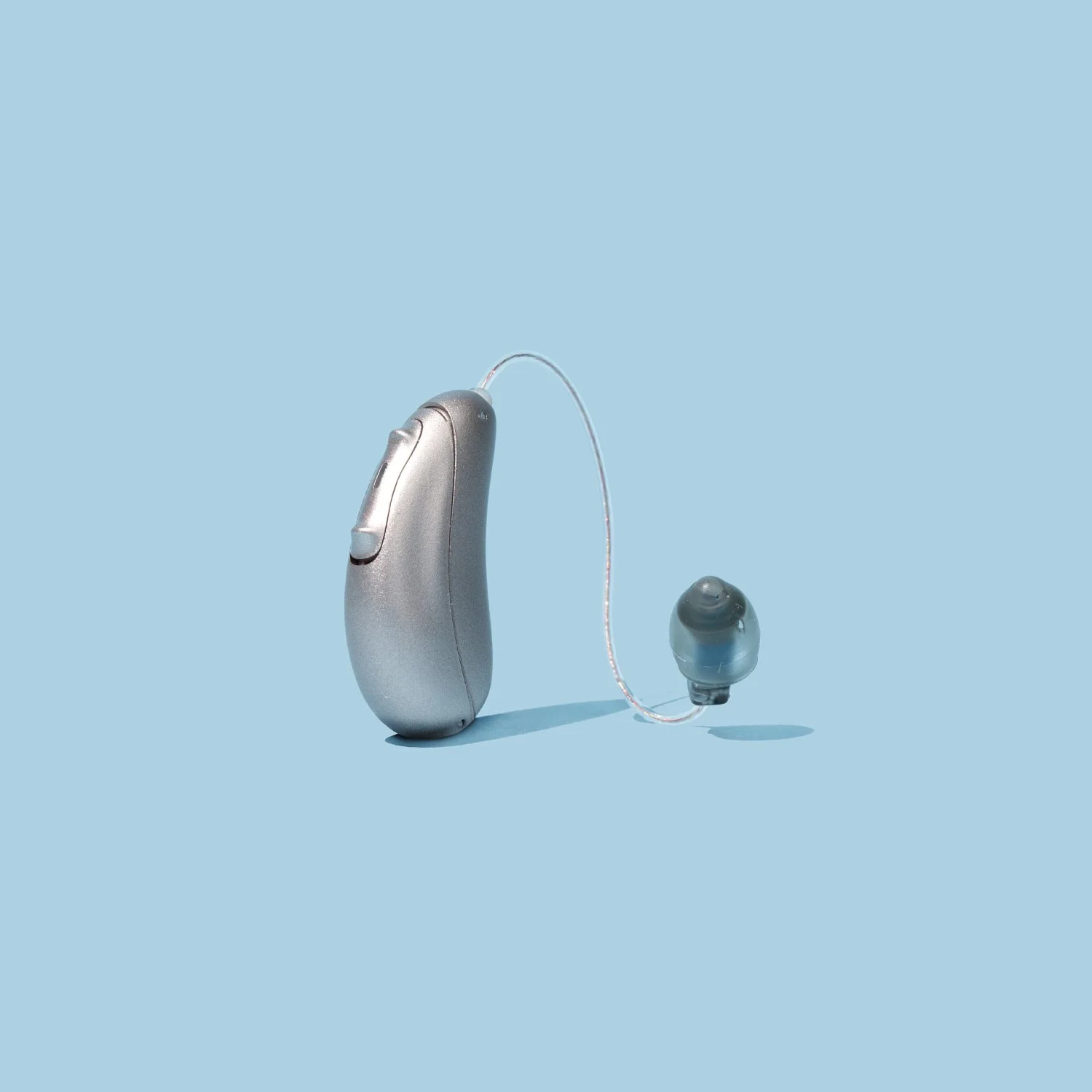
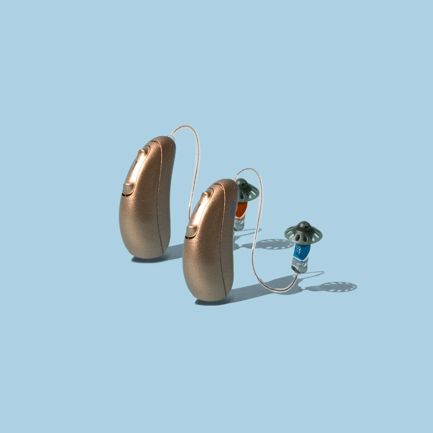
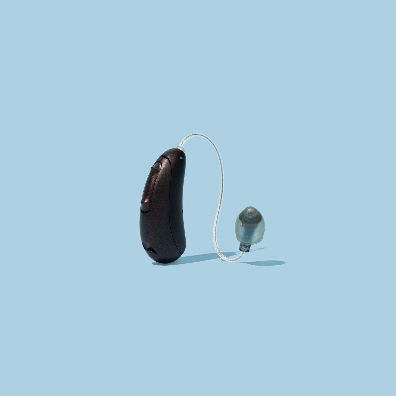
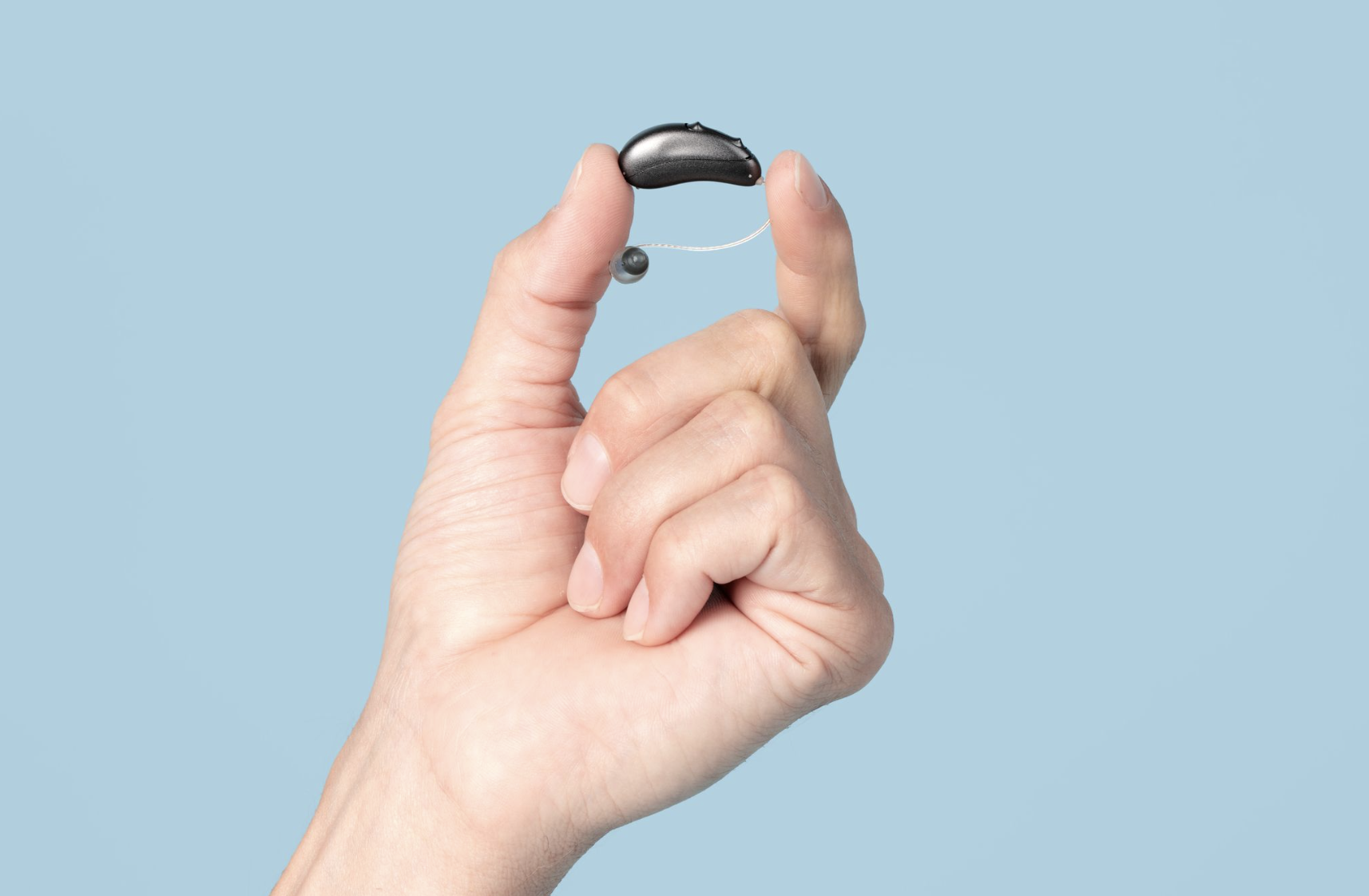
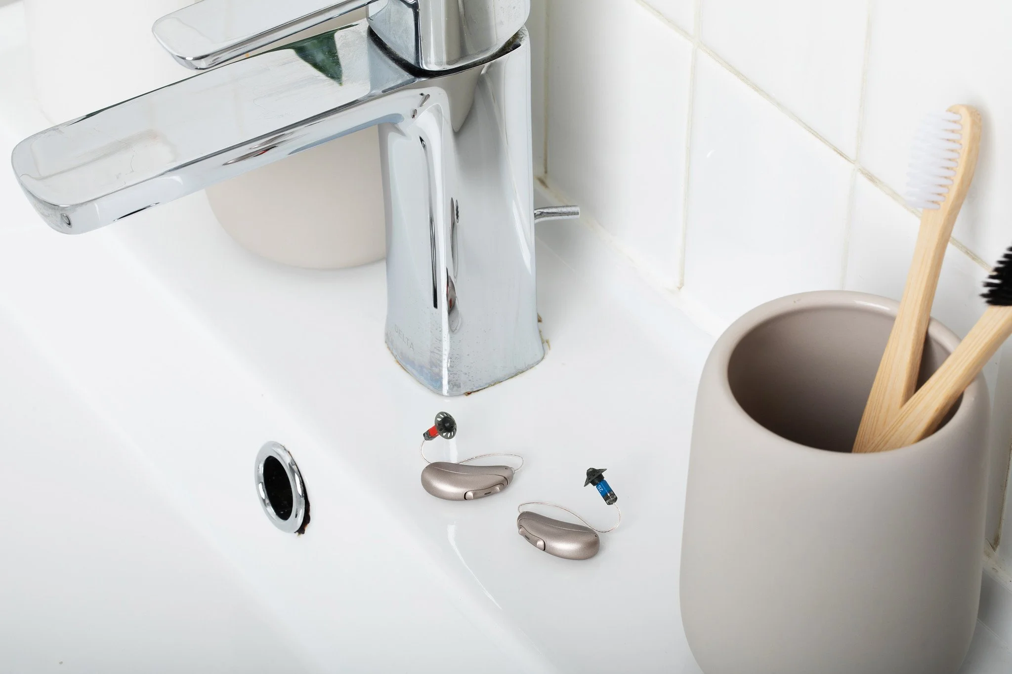
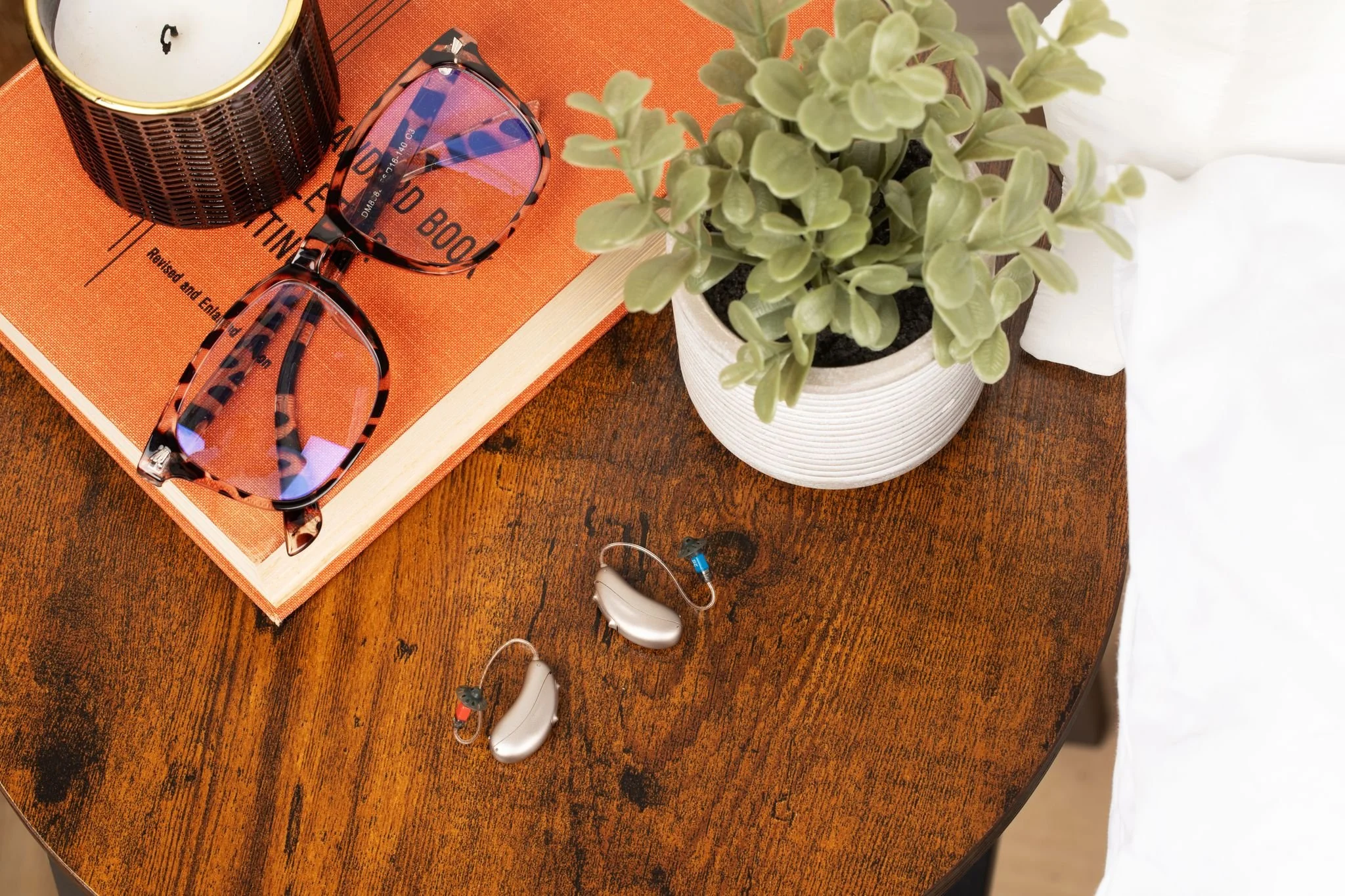
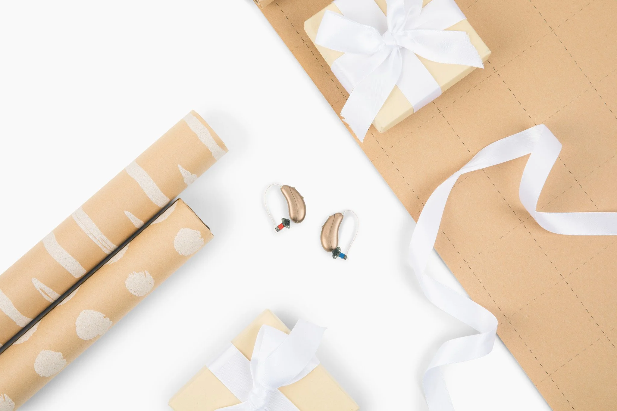
I work with an external agency to shoot all of products, flat lays and occasionally in hand photos. My goal for these product shots were to show how sleek this product is and the scale.
Our customer’s top concern is the size of our product so I try to show the size in relation to scale often and I try to show them in the environments that you might put them down at the end of the day.
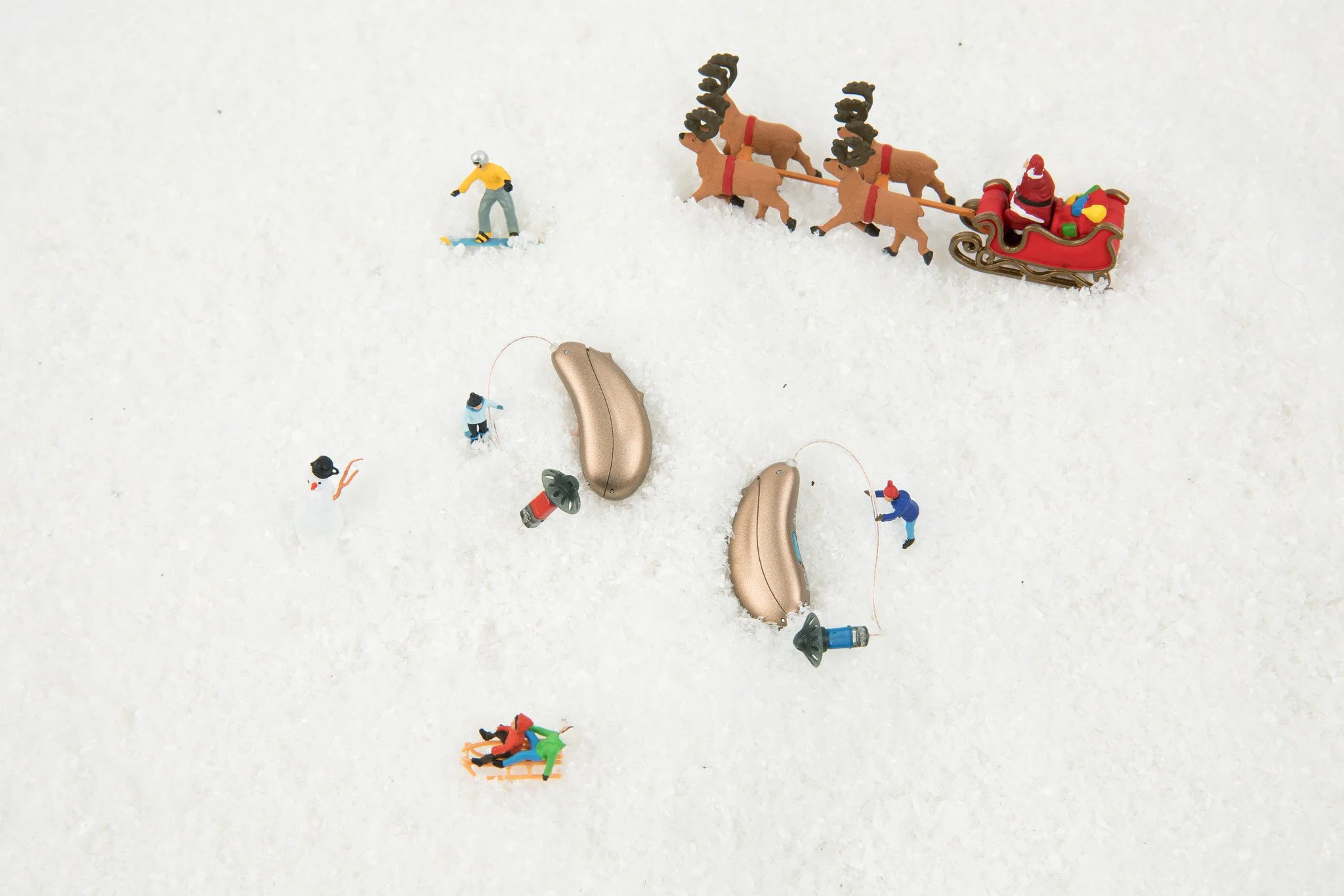
I also run our creative shoots for the holidays, the one with the little figurines absolutely cracks me up but, sadly, it doesn't test well with our users.
P.S. I recognize that baby blue isn’t fully ideal for product shots but the background options that this agency has… are not my favorite so the light blue is the best choice

Designer
Concept
Audicus found out that they were expanding into retail and decided they needed to update their current logo and icon to improve brand recognition both in-store and online.
I was tasked with this redesign but maintaining our logo recognition enough to keep the trust of our current customers.
Objective: Increase brand recognition with both the logo and icon
Problem: People think we are a “scam” company so switching up our logo too drastically could negatively impact the goodwill we have built with our consumers
Solution: Alter current logo enough that the icon can sit within but also stand alone

The old logo and icon
Iterations
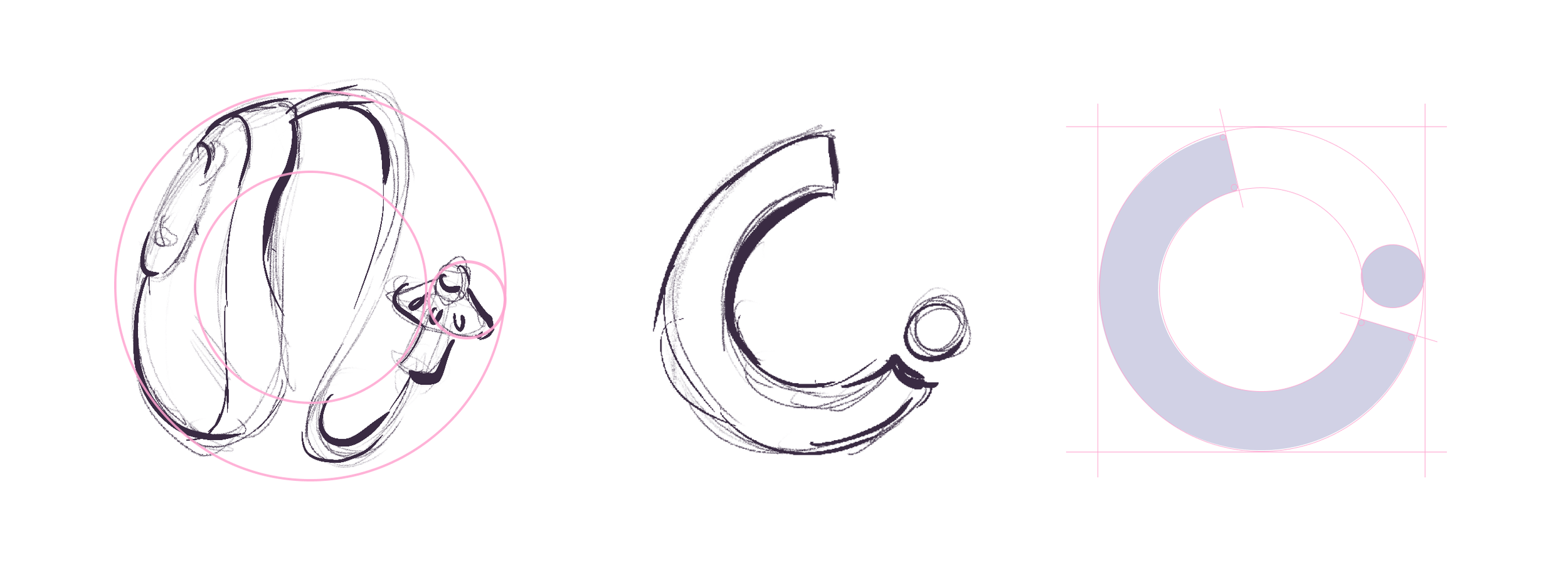
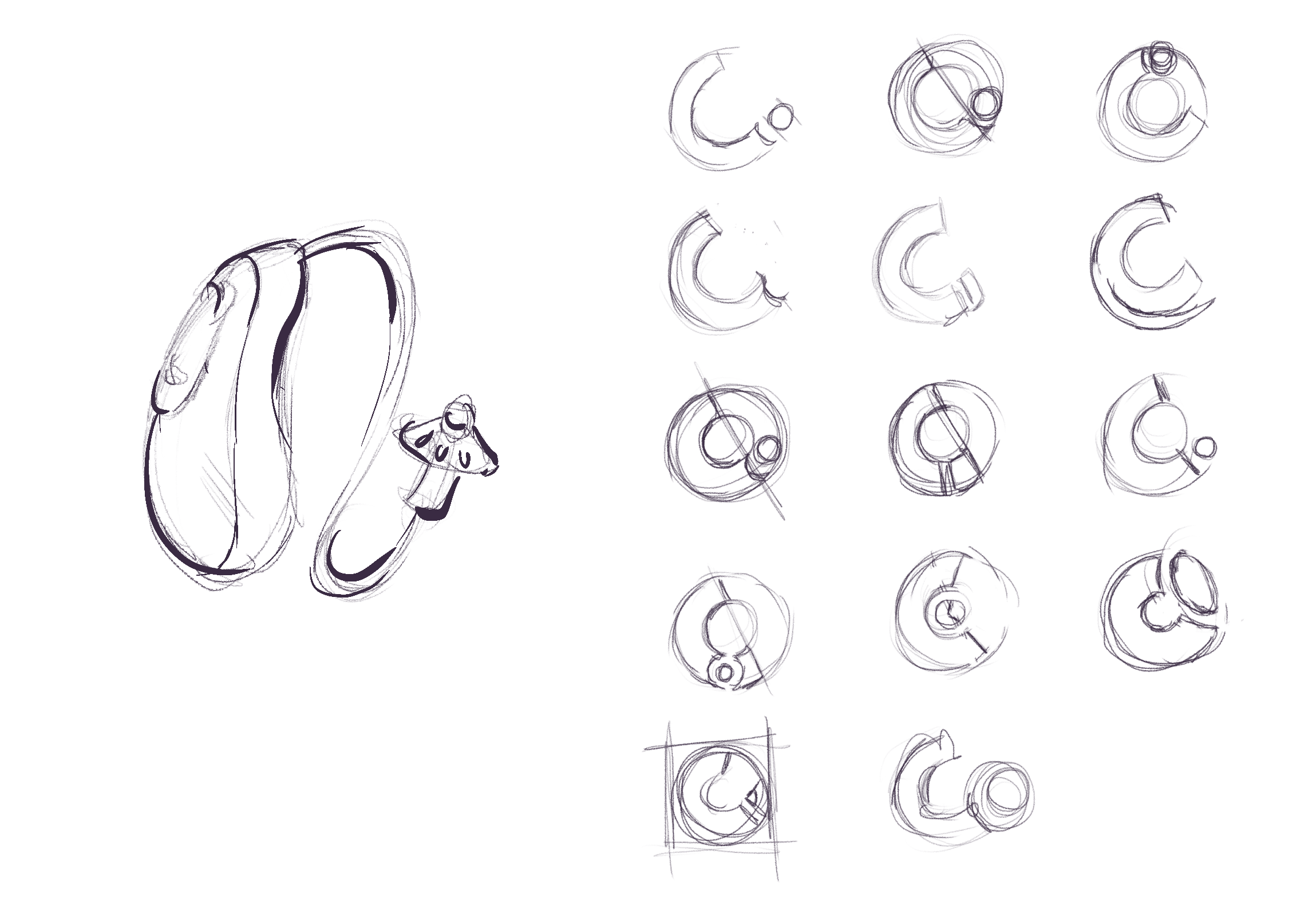
Our old logo was close to where we needed to be so I knew that I had to find a way to make a twist without losing all brand recognition. Our old logo was based on the wifi symbol, I switched it to our hearing aids.
Without deviating too far from the original, I wanted to make an abstract version of the hearing aid but mimicking the curve of the hearing aid with the ear bud.
The New
When deciding on the new logo I was really determined by the icon. Whichever would fit the best within the logo but could also stand alone and reinforce brand recognition


Product Designer
User Researcher
QA
Our hearing aid simulator was created in order to show people the type of hearing enhancement they could expect from hearing aids without having to purchase. We chose to work with an external recording studio who could effectively record the sound through a hearing aid opposed to doctoring the audio ourselves.
Objective: Create an captivating lead capture tool while selling individuals on the product
Problem: Our audio wasn’t very captivating and the script was lacking.
Solution: Design an immersive experience that both stimulates the visual and audio experience.
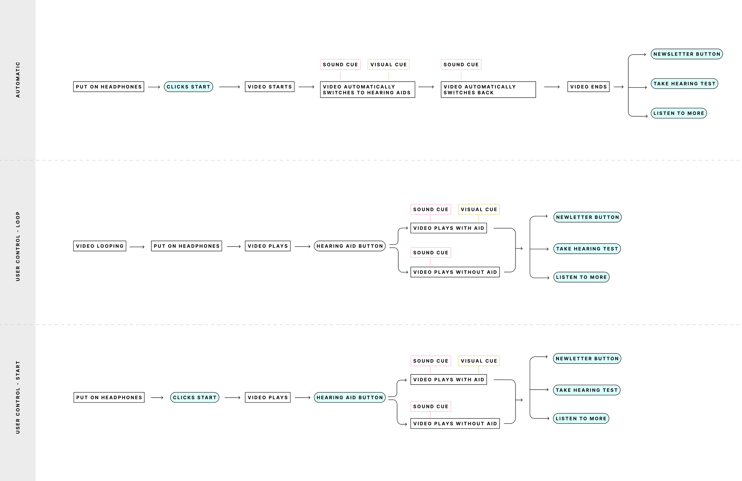
User Flows
How do we get a 65+ year old to interact with our hearing aid simulator correctly? The answer? breadcrumbs… and lots of them.
There were quite a few pathways to explore considering this would not only be a virtual tool on our website but also an interactive tool in a retail space.
After user testing, we opted to make it fully user controlled with no automation to ensure that the user is immersed in the experience.
Layout
In terms of designing for both an in-person and web experience, I had to really consider what could easily translate from an iPad to desktop. We have very limited dev resources so unfortunately I had to try to sort out a one-size-fit-all solution. Luckily, I was told that the in person experience was the focus so I went with the full screen experience.

High Fidelity
Since lead capture was the ultimate goal of this product, we had to sprinkle in lead generating screens between every scene. We used this opportunity to drop in fun facts about hearing and help sell hearing as a whole.
I had to include multiple visual clues to ensure the user understood that the hearing aid was on, including a hearing aid button and editing the video to go from blurry to clear to help guide the user to know that the hearing aid is turned ‘on’.

Product Designer
User Flows
Prototyping
When I started at Audicus, they had a pre-existing hearing test but its branding was all over the place and the user experience wasn’t very thoughtful. Users struggled to get through the exam, it was too long and it lacked any proper checks for anomalies/user error.
Objective: Allow those who don’t live close to audiologist take a reliable hearing test from the comfort of their home
Problem: People often times don’t trust online exams but also environmental factors can contribute to poor test results
Solution: Create an exam that has clear instructions on how to take a successful exam while leading them through a seamless test experience.

Web App
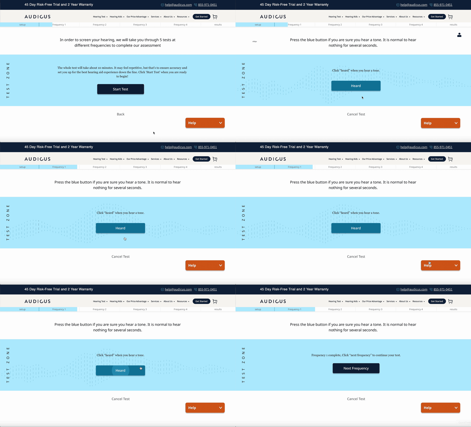
We started by redoing the web app. The only experience was slightly confusing and the colors used did not have enough contrast for this demographic to read easily.
I decided to make the “heard” section the main event on this page. We want to eliminate any confusion about what action was expected from them.
Another goal was to eliminate the fatigue that the old exam created. Working with the backend, we came up with a better solution for how to test the frequencies and how to retest hearing test anomalies without creating too much friction.
Hearing Test Results
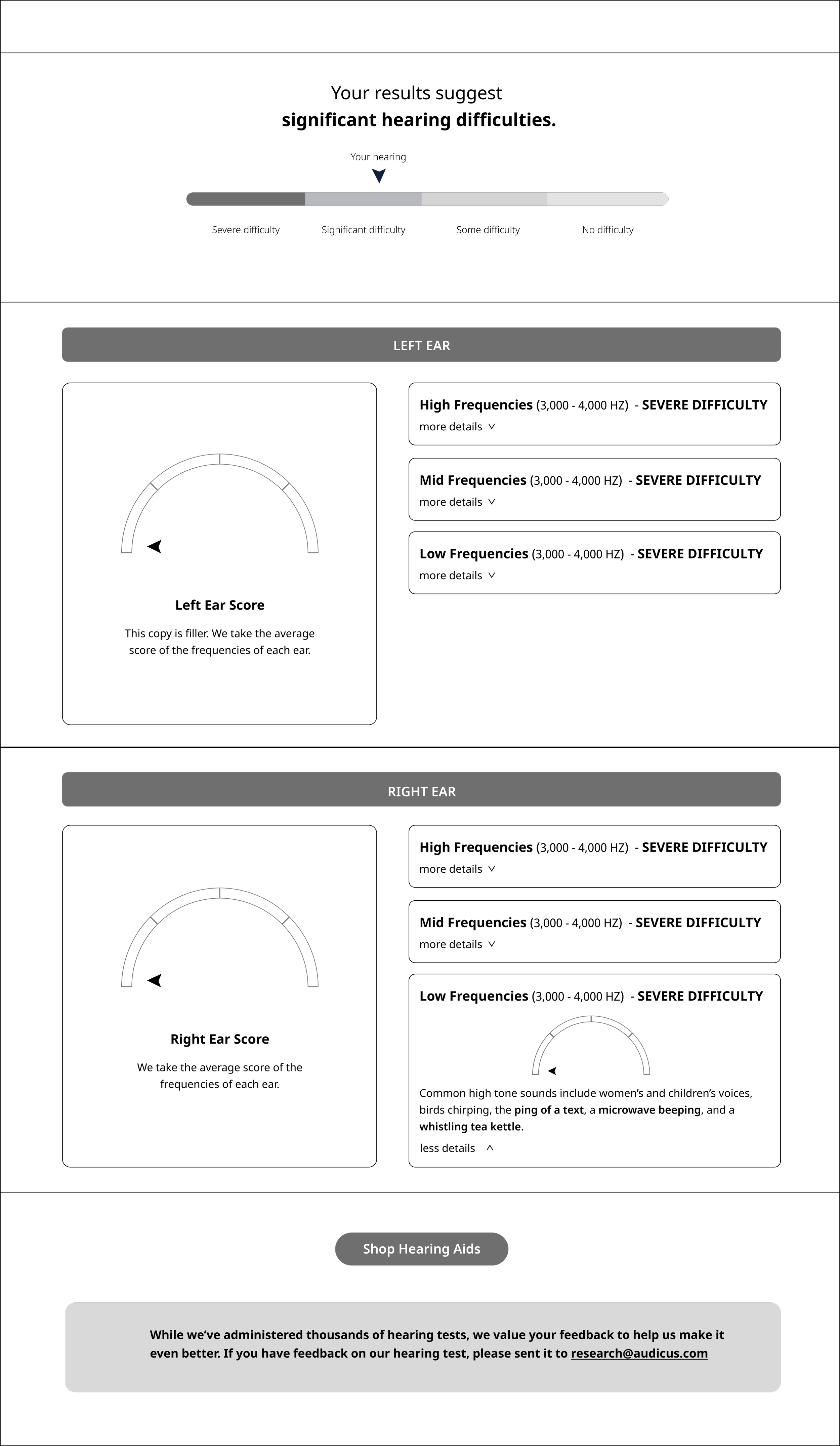
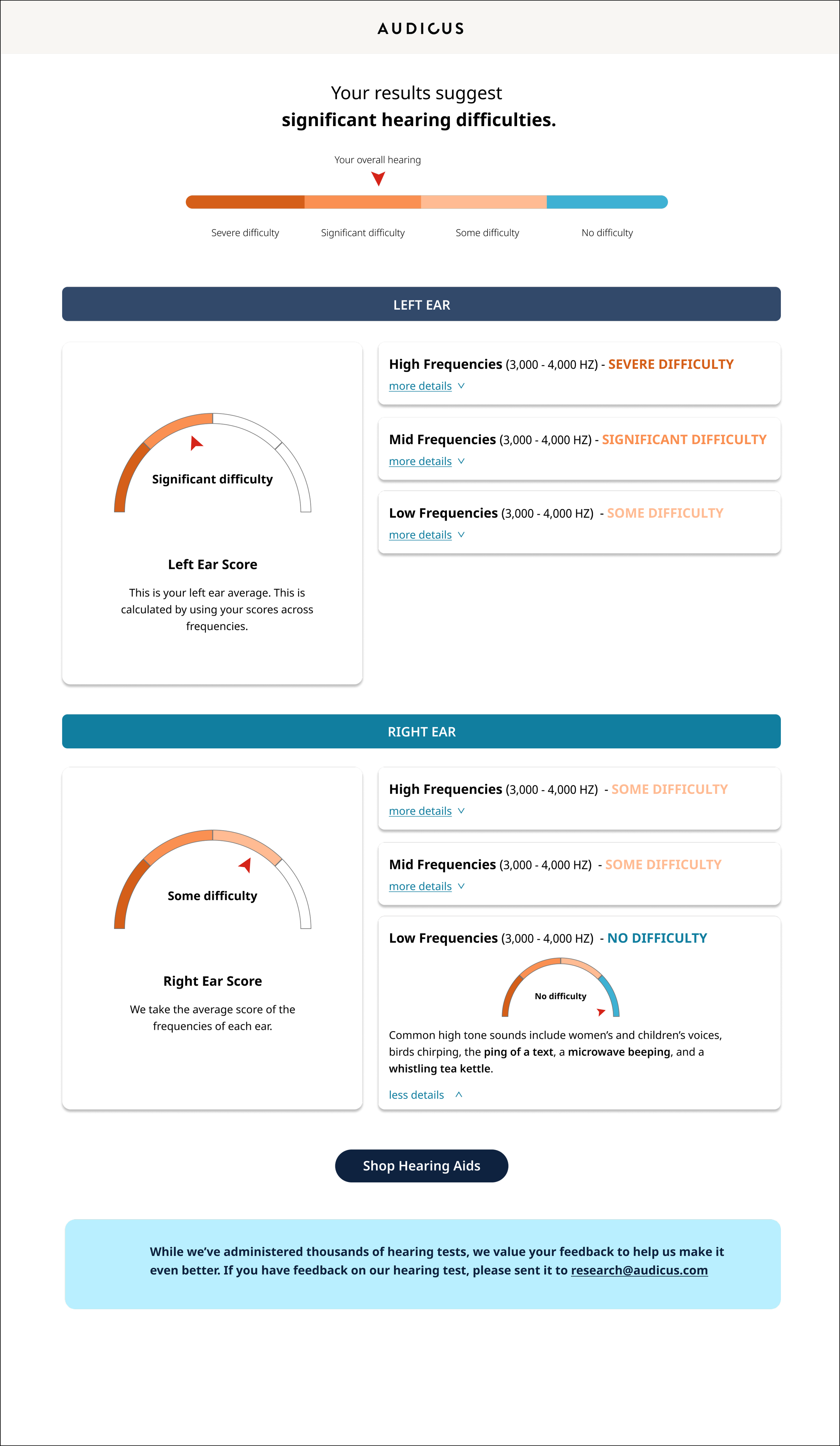
The results page was an interesting problem, we are not technically doctors so we cannot show a true audiogram to the customers. How do we make it look like real test results without it seeming prescriptive.
We learned that individuals needed a scale to put themselves on in order to understand the severity of hearing loss.
It is important to note, if someone’s hearing was too severe, we would direct them to an audiologist. We are not in the market to sell to people that we can’t truly help.
Print Results
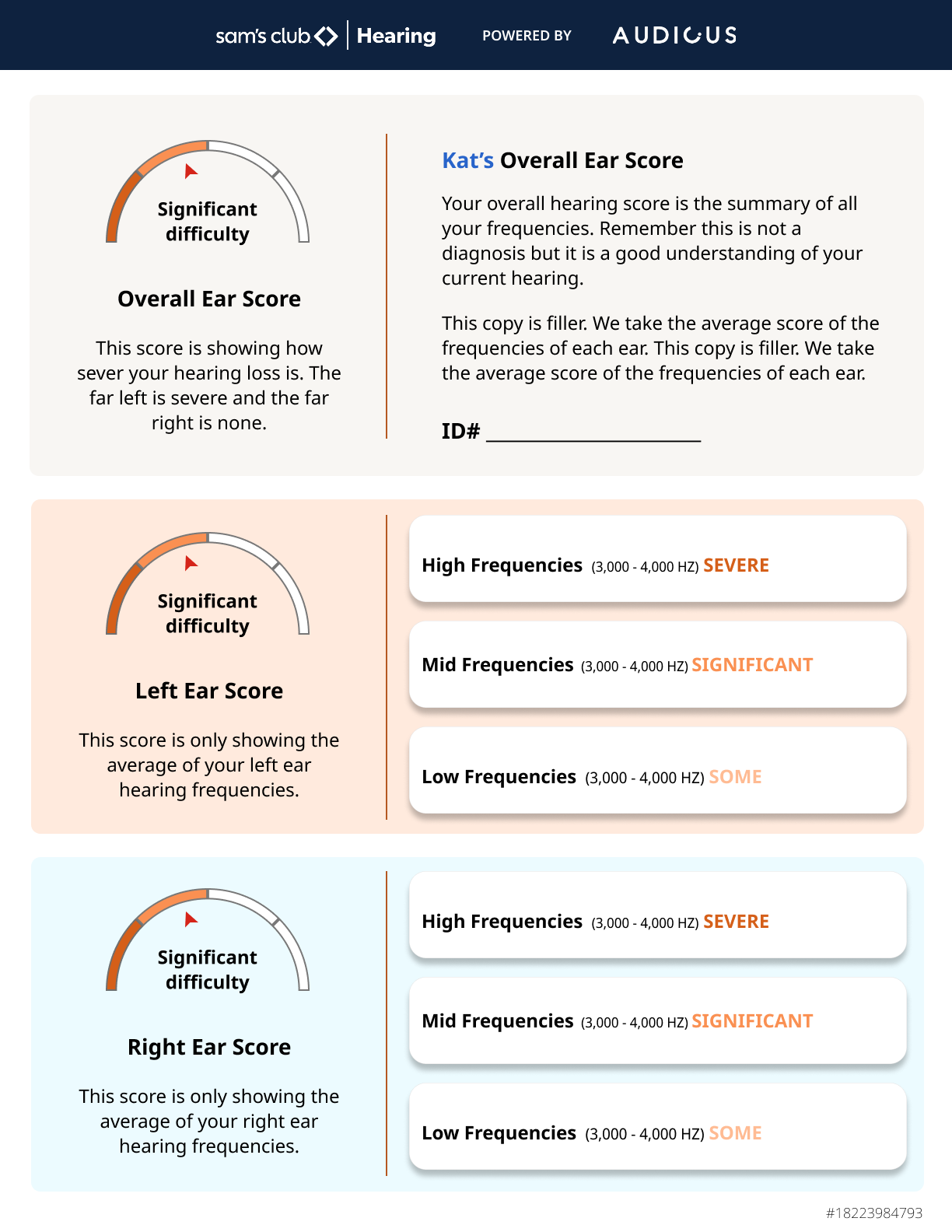
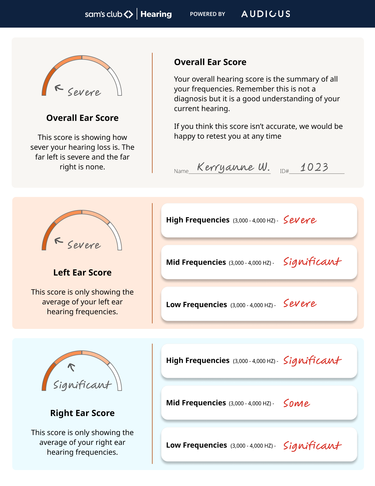
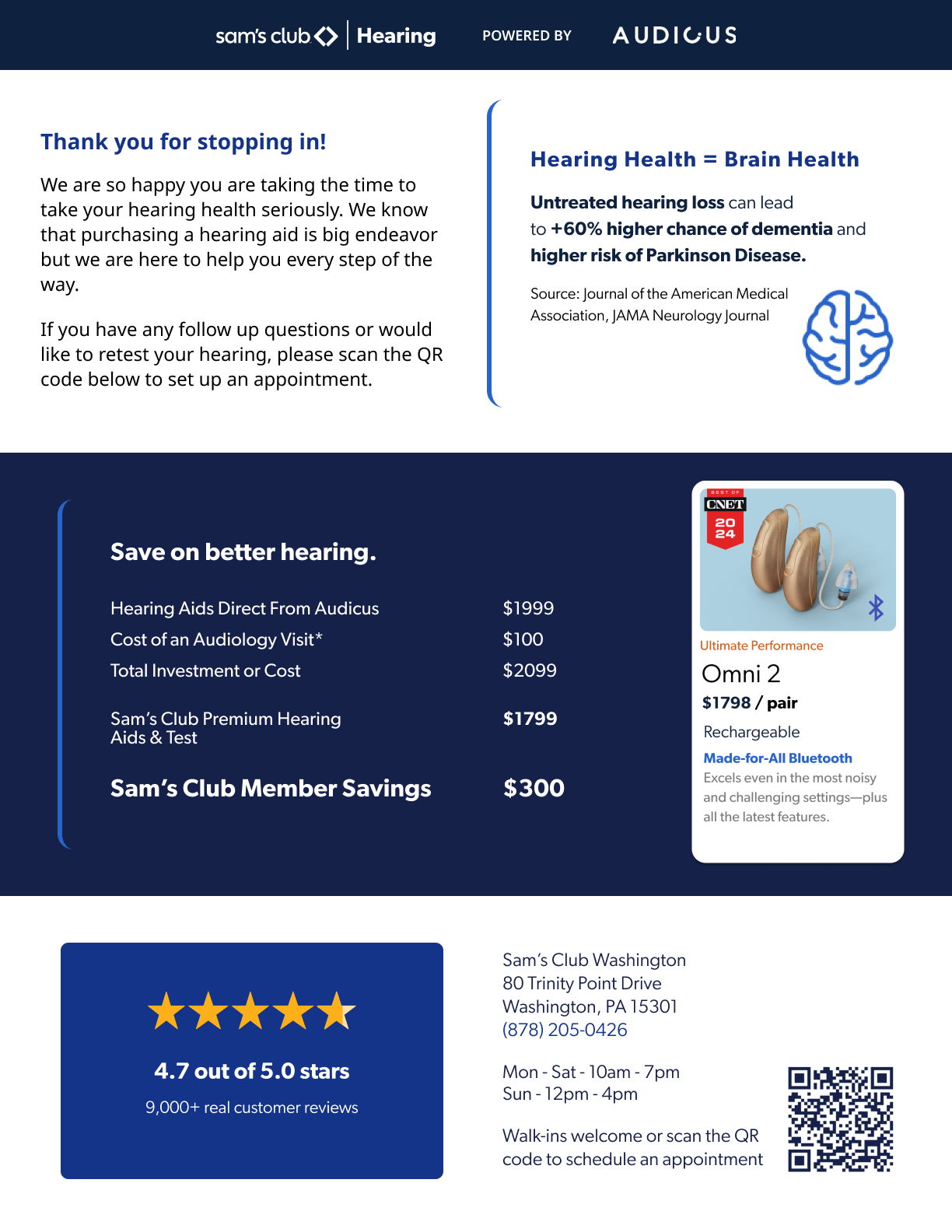
We faced a problem once we took this test in store, what if the person does not have an email to receive their hearing exam results?
We decided to come up with a quick and digestible print out which also serves as an extra little sales pitch just in case they forgot pricing, location or benefits.
Another snag occurred, most of our sales reps dont have a printer easily accessible, how would they be able to hand someone their results? Luckily this solution came fast and easy and allowed us to get in store faster without having to rush the backend.

Print Design
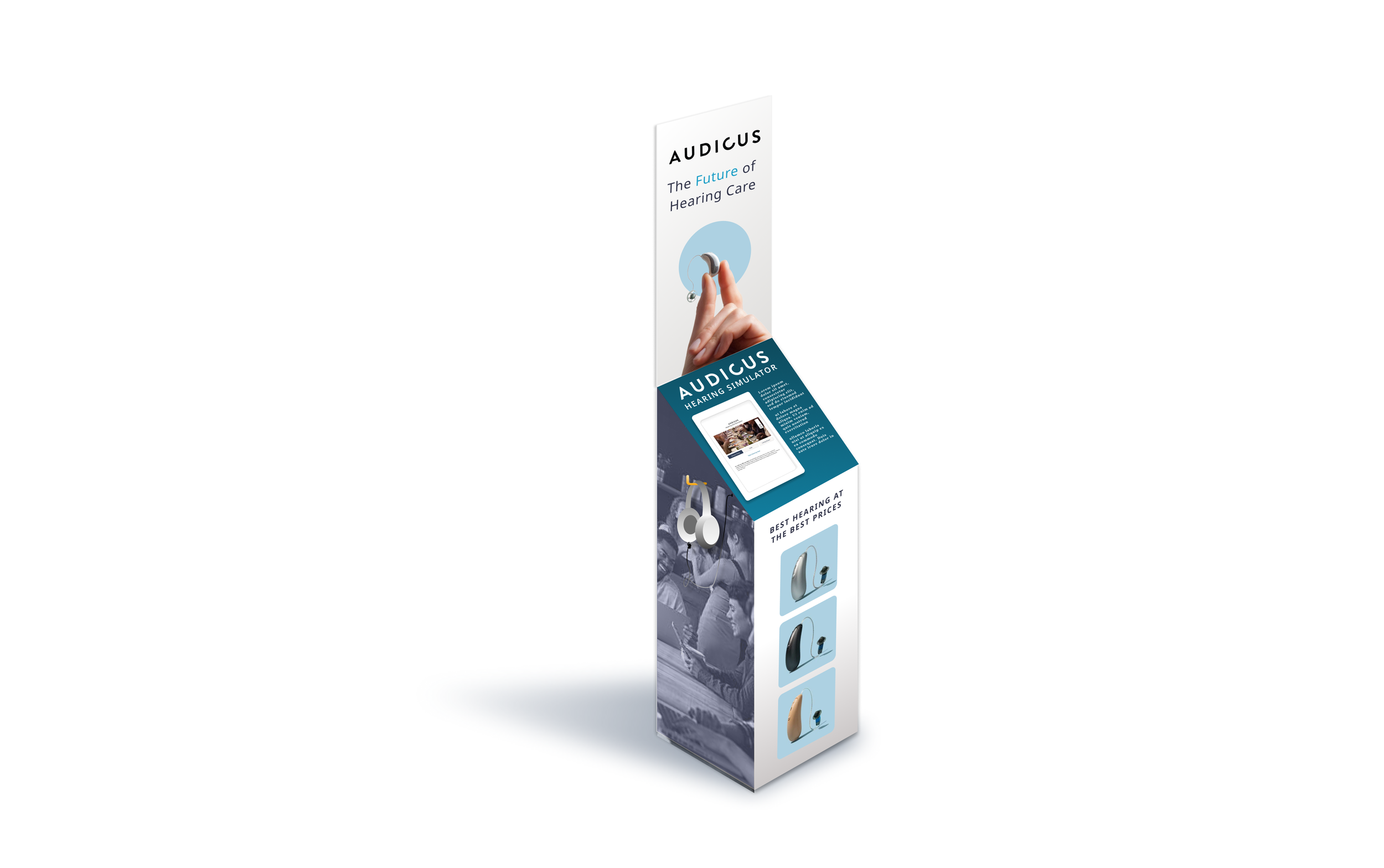
Kiosk Wrap Design
Digital Marketing Design
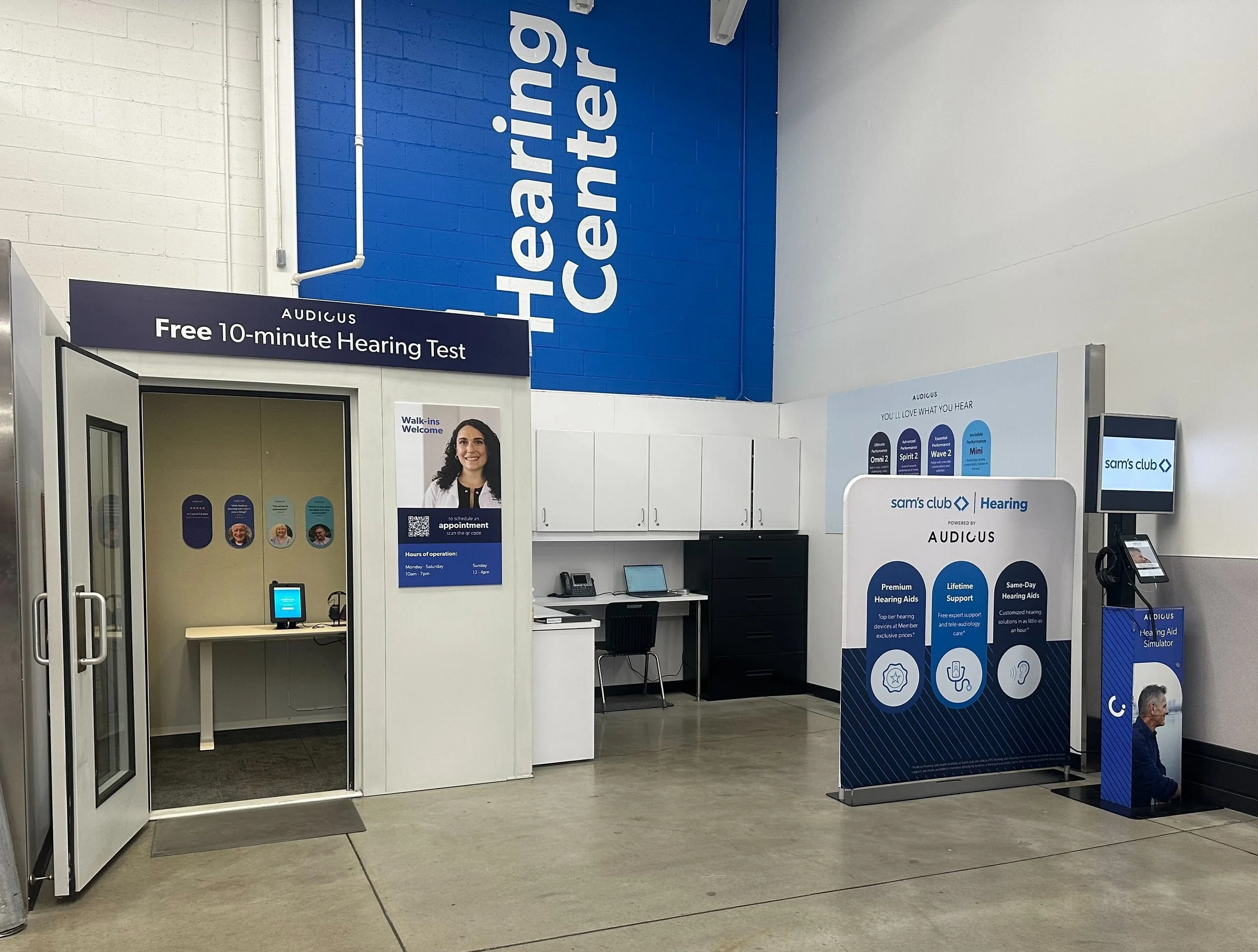
Audicus partnered up with Sam’s Club to embark on our retail journey. There was a preexisting hearing center in Sam’s Club that we had to “take over”. Getting visuals approved by a company as big of Sam’s Club was a long and arduous experience. We ultimately were no longer Audicus in Sam’s Club but Sam’s Club Hearing powered by Audicus. We had to fully strip away our identity and operate fully within the Sam’s Club design system.
Objective: Catch shoppers eye and intrigue while they are shopping in Sam’s Club and encourage them to test their hearing or interact with our simulator kiosk.
Problem: There was another hearing aid company there before us who never staffed their cubicle and were very unreliable.
Solution: Create an eye catching display that allows user to interact without fulfilling committing to the hearing aid experience. Create avenues that allows the user to test at home or in store while offering our exclusive Sam’s Club pricing.
Initial Sketches
When we started this project, we did not know how big we could be, where it would live, would it be our hearing test examination location as well as our simulation station? There were many questions mark to start but that made the sketching all the more fun.

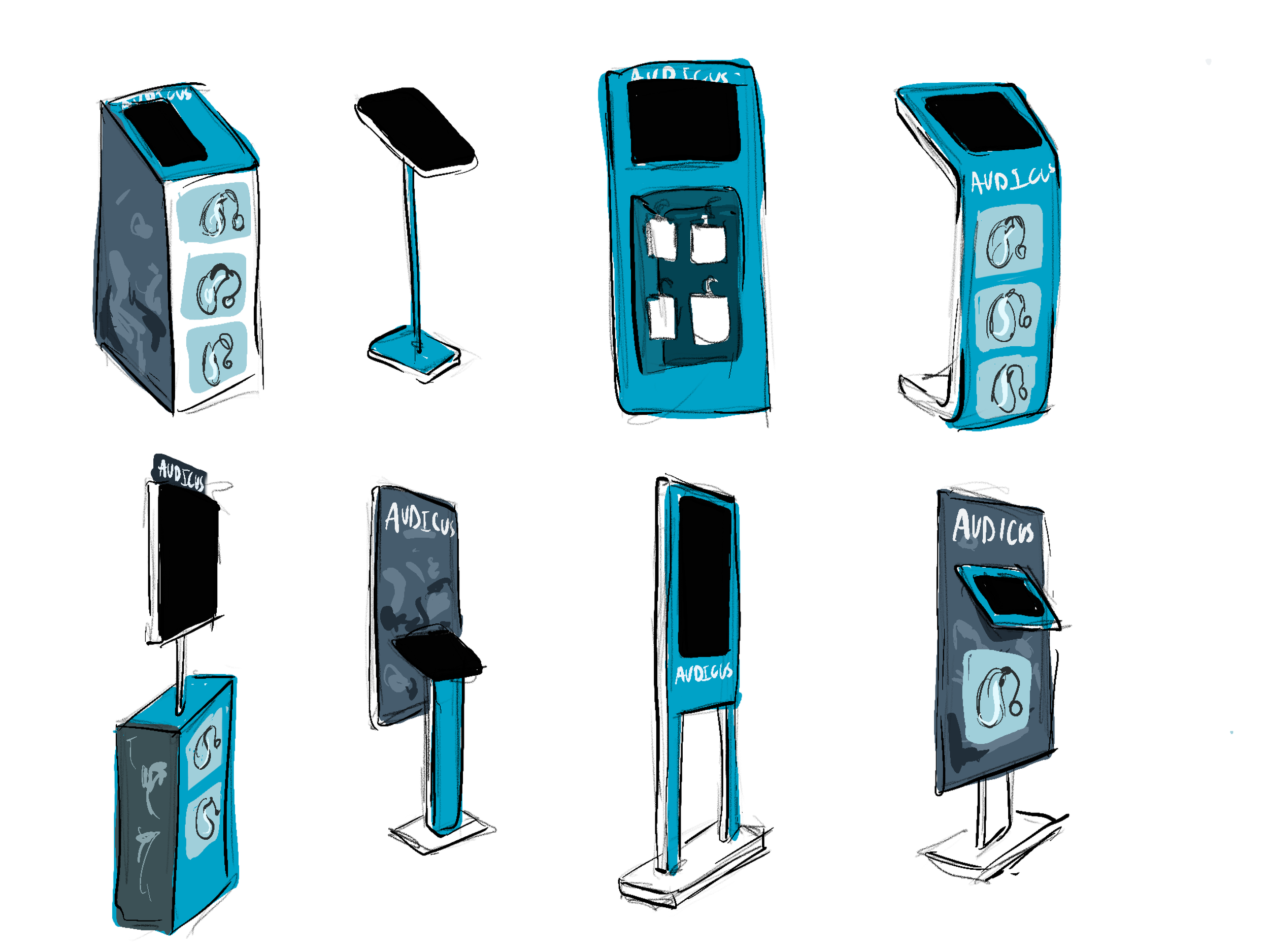
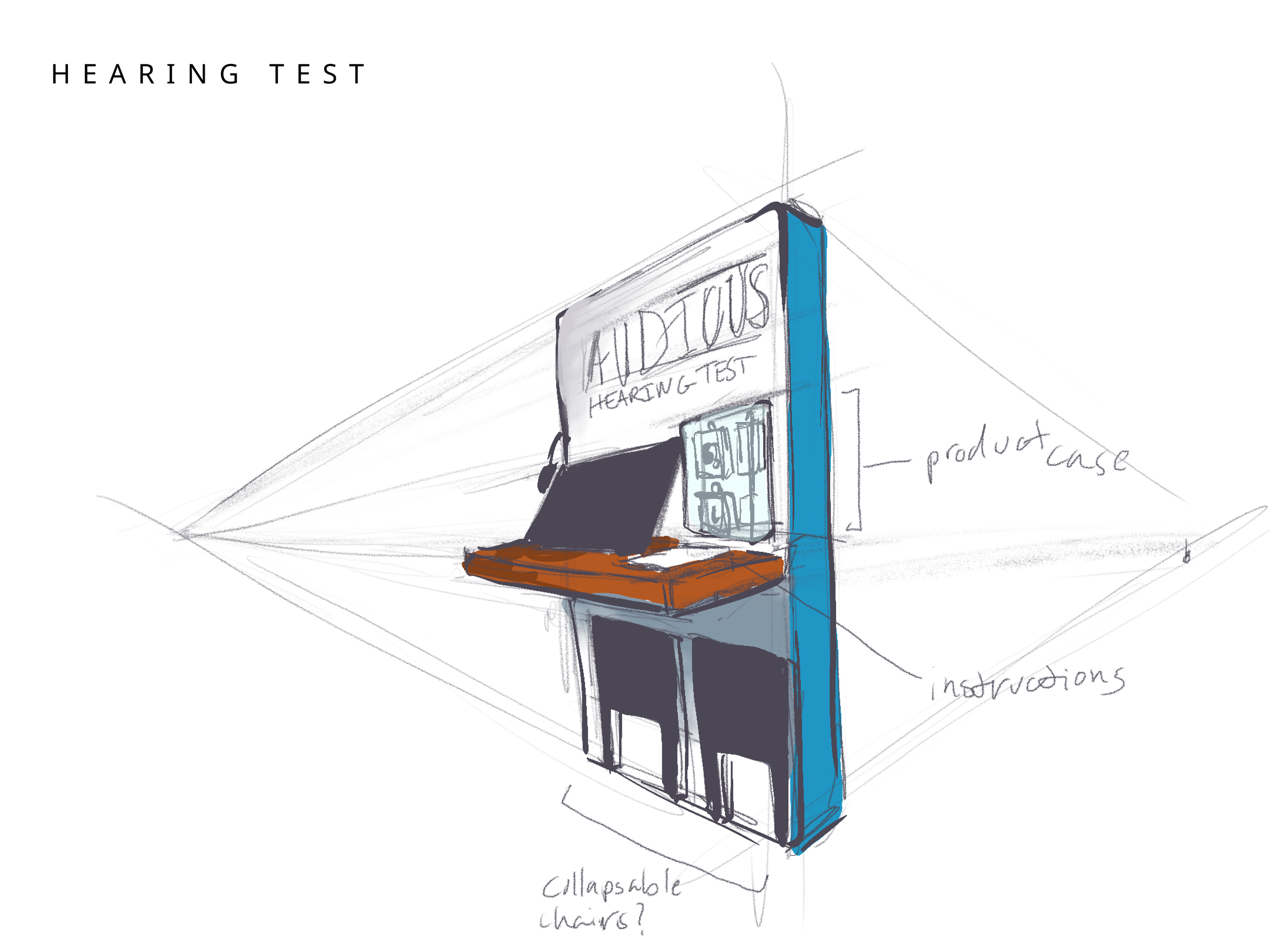
Full Kiosk Sketches
As negations with Sam’s Club progressed, we realized that these would be two separate entities but would work together in our own hearing clinic space.
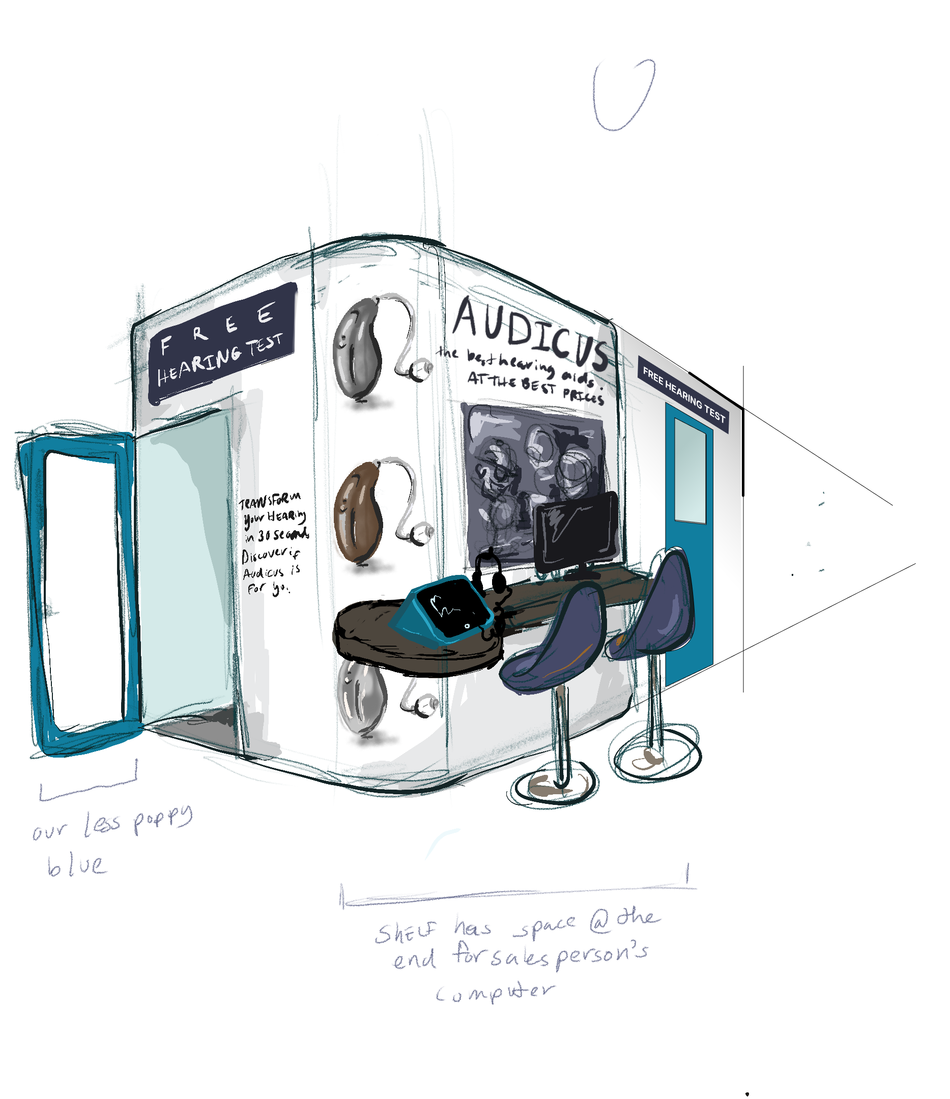
Working with Sam’s Club we had to determine what was allowed to live exterior, how much were we allowed to change from the existing space. The short answer, we were not allowed to change much and if we did, we had to mask it as a Sam’s Club entity… and that is exactly what we did.
I worked closely with a Sam’s club to ensure that I was being respectful of their brand without completely losing our own. After 25 iterations, we settled on the full installation at the bottom.
Not as jazzy as I would have liked but we got it across the finish line without getting yelled at, so that was a win.
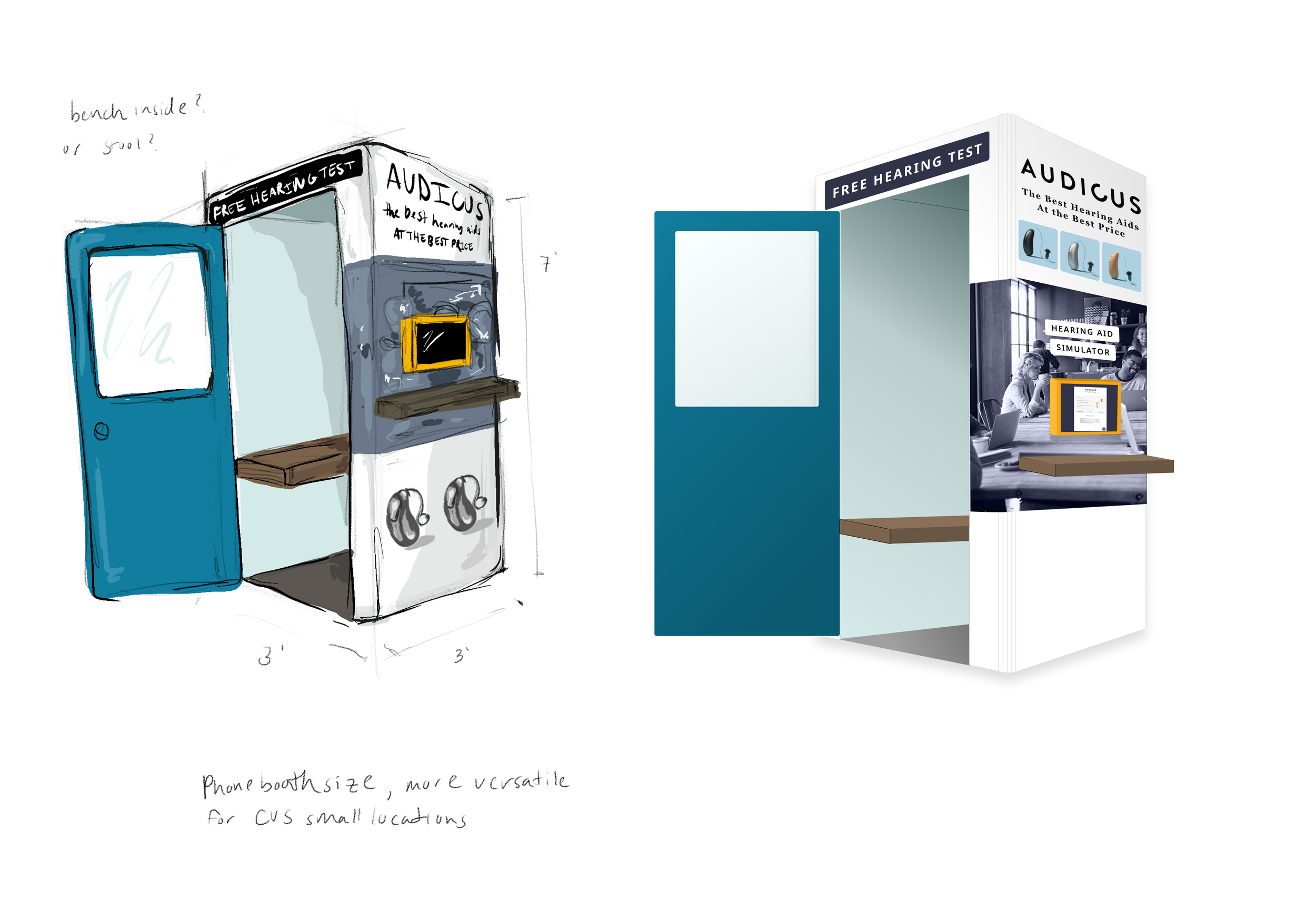
The Final Result
This was my first time designing for retail and designing for larger prints. I learned a lot from the design perspective but also learned how to negotiate with a company as large as Sam’s Club. I learned how to concede parts of our brand without losing our whole identity.

Product Designer
User Flows
Asset Creator
Art Director
QA
This was a big project that I had to fight to get started. Audicus when I arrived, hosted their e-commerce site on a free version of Wordpress with nearly 100 plugins. We were unable to fix the smallest of things due to lack of dev resources and a disastrous code base. I realized the need for a complete recode when I was trying to implement my brand overhaul. Adjusting the font styling across the site required our “devs” (this isn’t shade, we just never had a real developer until a few months ago) to go page by page, section by section because there was no formalized style sheet.
Objective: Create a professional website that increased the trust of our consumer while creating a seamless user experience for the 65+ demographic.
Problem: We lacked a proper dev team and a few of our key stakeholders considered our current website “fine enough” although our tech debt was through the roof and editing the css sheet would break the entire website.
Solution: Create a project roadmap clearly defining the steps in order to achieve a website overhaul, collect user research to ensure that our changes met their needs and work closely with our sales and cx team to ensure that we were solving the problems they encounter.

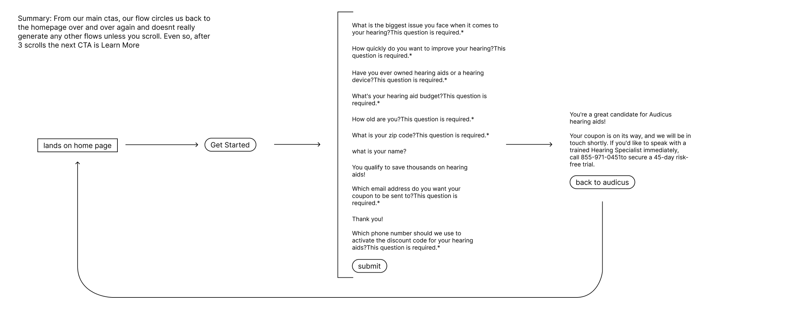
The Original Flow
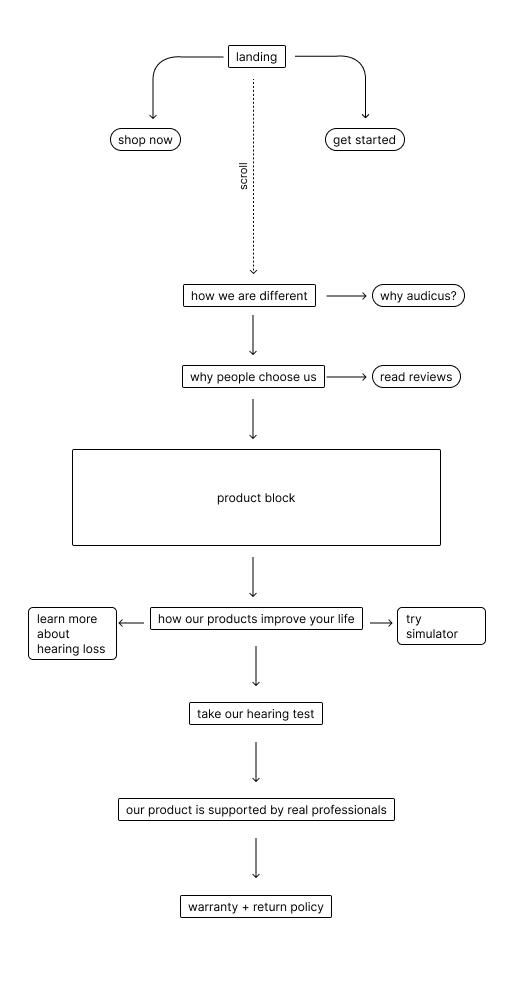
When I first joined Audicus, the website flow was singular and a trap. All website changes and requirements were driven by sales up until I arrived… and all they cared about was lead capture which resulted in this doom cycle of a flow.
The New Flow
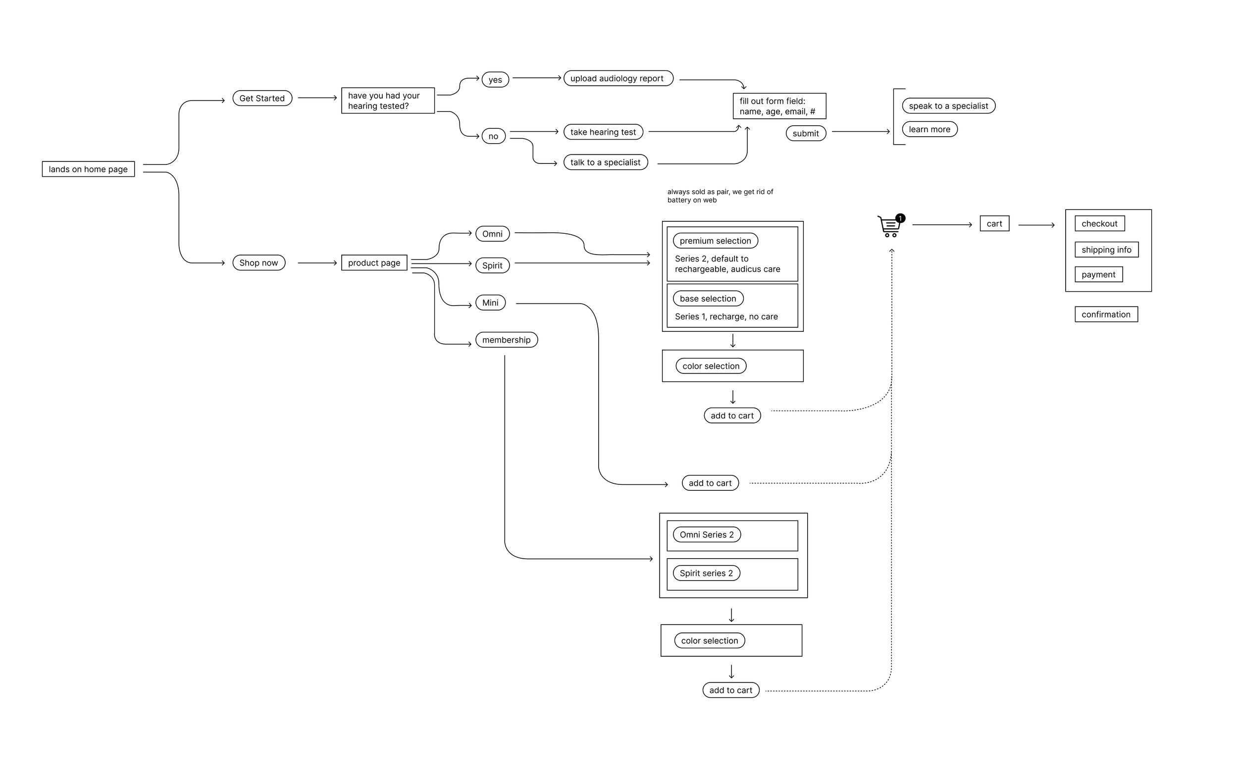
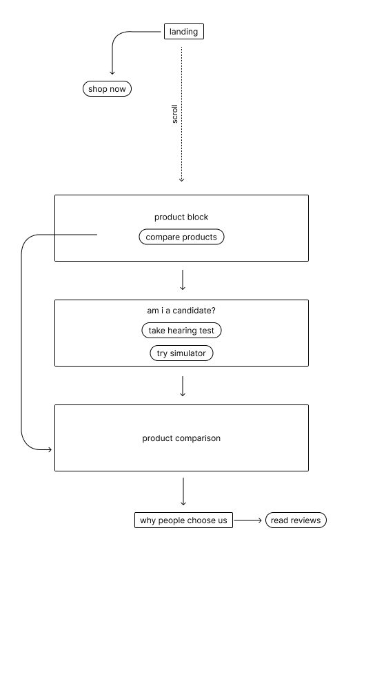
The new flow that I designed had two pathways: lead capture and unassisted checkout.
At the time, unassisted checkouts were sitting around 15% of all checkouts and this was due to our huge focus on lead captures and our phone sales agents. One month post launch, we saw an uptick to 40% unassisted checkouts.
Another challenge of the pre-existing flow was that it took about 30 clicks from start to finish to complete an order. This was partially due information overload, unnecessary selections and once again, lead capture.
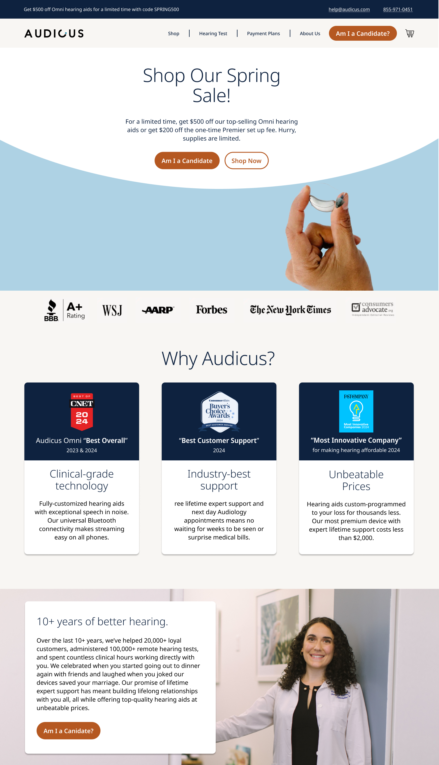
HOMEPAGE
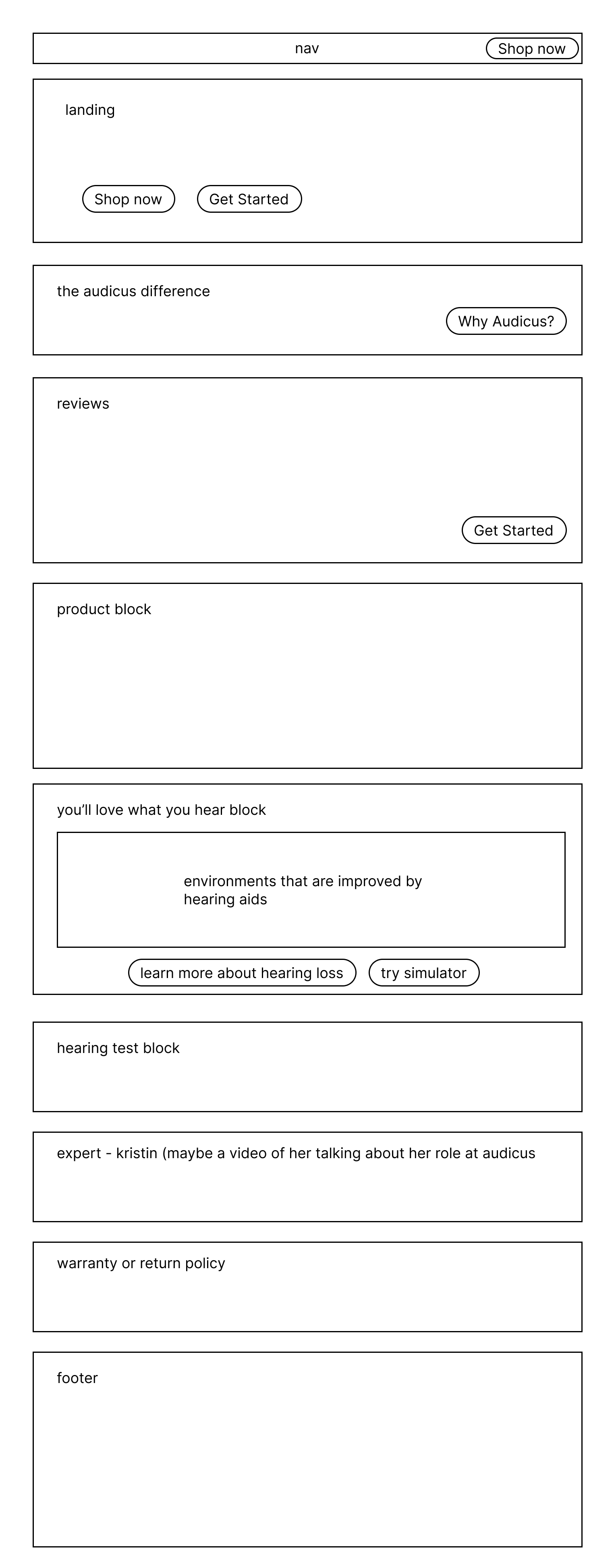
Since I switched the flow to be a two pathway experience, this meant that the architecture of our homepage needed to change. Although lead capture was still important, we needed to promote shopping on ones own and feel like they had the autonomy to do so.
But, due to this demographic, we provided “guard rails” so at any point in the unassisted pathway they could talk to an agent and enter the assisted pathway.
On top of just improving the flow of the site, I realized that our site lacked human empathy. Hearing loss is extremely emotional and effects many aspect of your life. I included the health benefits of hearing aids but also highlighted the environments in which hearing aids could improve your enjoyment of them again.
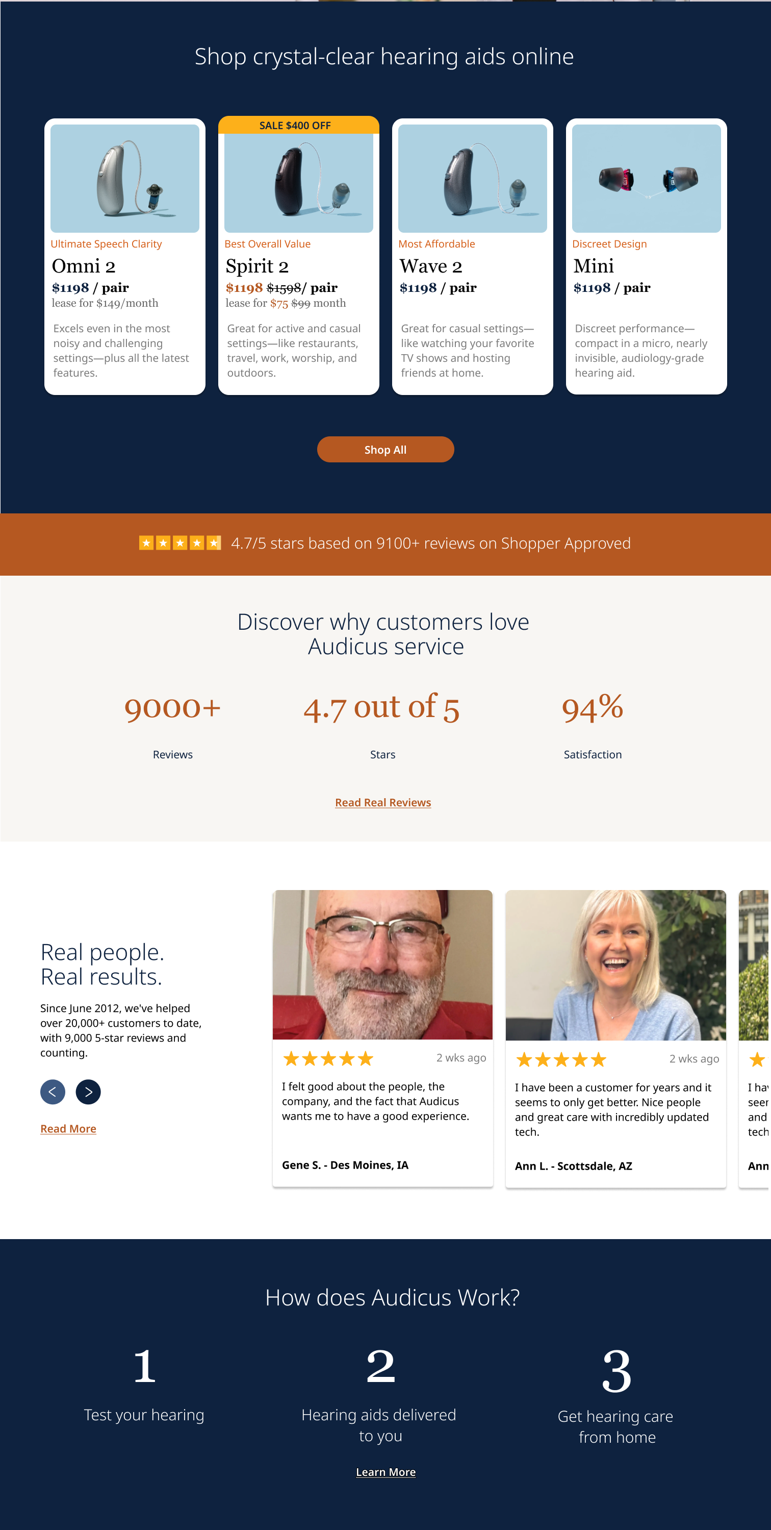
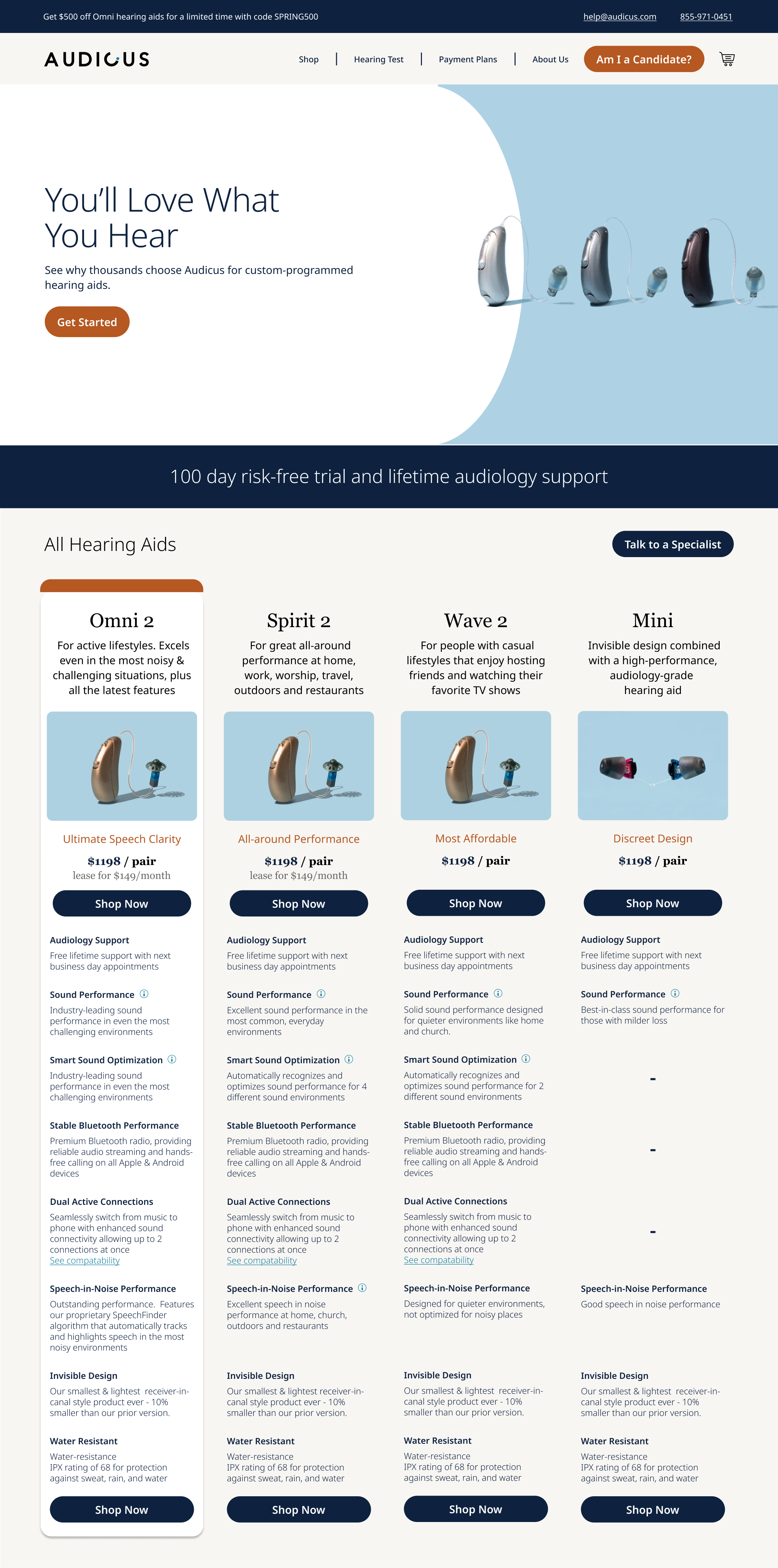
Our product thumbnails were an interesting challenge. How much information do we overload them with at the start? Will someone ever be able to make a selection from the home screen alone? How much of a factor is price in our users decision making?
We decided instead of overwhelming them with tech jargon in these thumbnails, lets describe the type of lifestyle these hearing aids work best for in order to simplify customer’s understanding of the product.
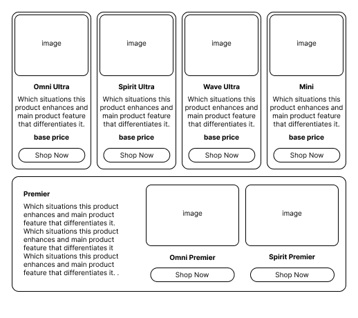
SHOP ALL
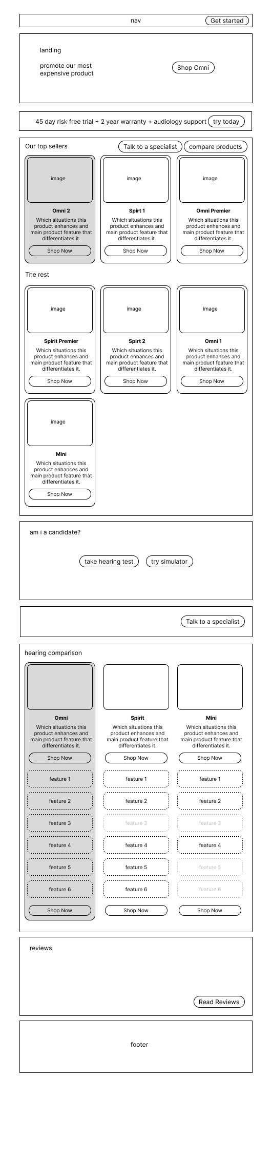
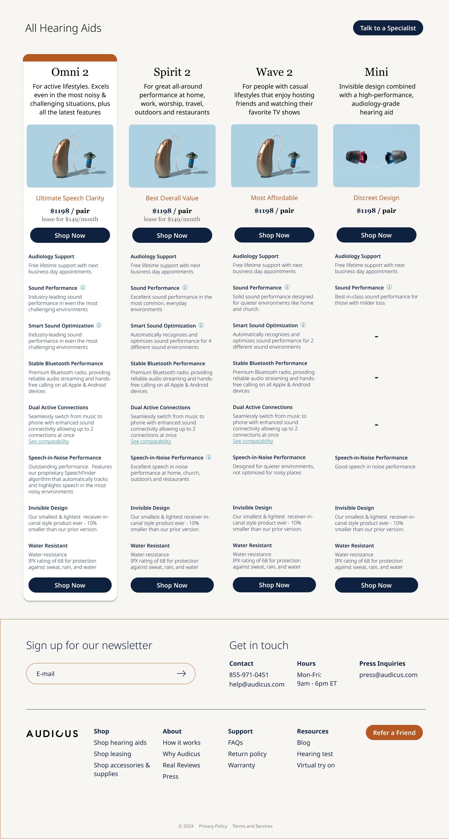
At the time of the redesign, our product line up was nine products. We had series 1 vs series 2 and premier vs non premier and we were seeing that customers really didn’t understand the difference and that they were overwhelmed by choice. During the redesign, I fought to simplify the product lineup and move the premier (our subscription option) to be a selection within the individual product page but also give it its own landing page.
Once again, fear of information overload was top of mind when designing this page so I wanted the flow to be simple.
This is our product lineup
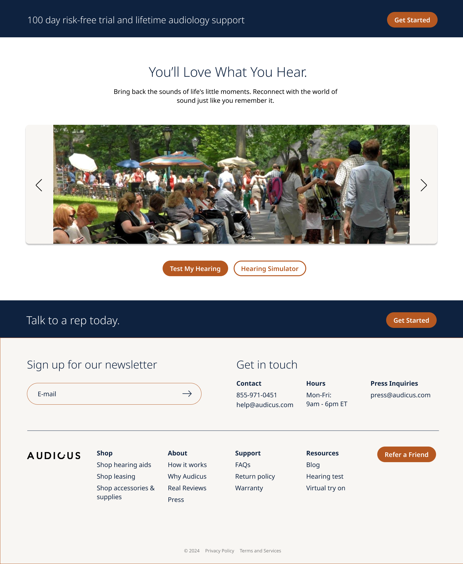
Do I even need hearing aids?
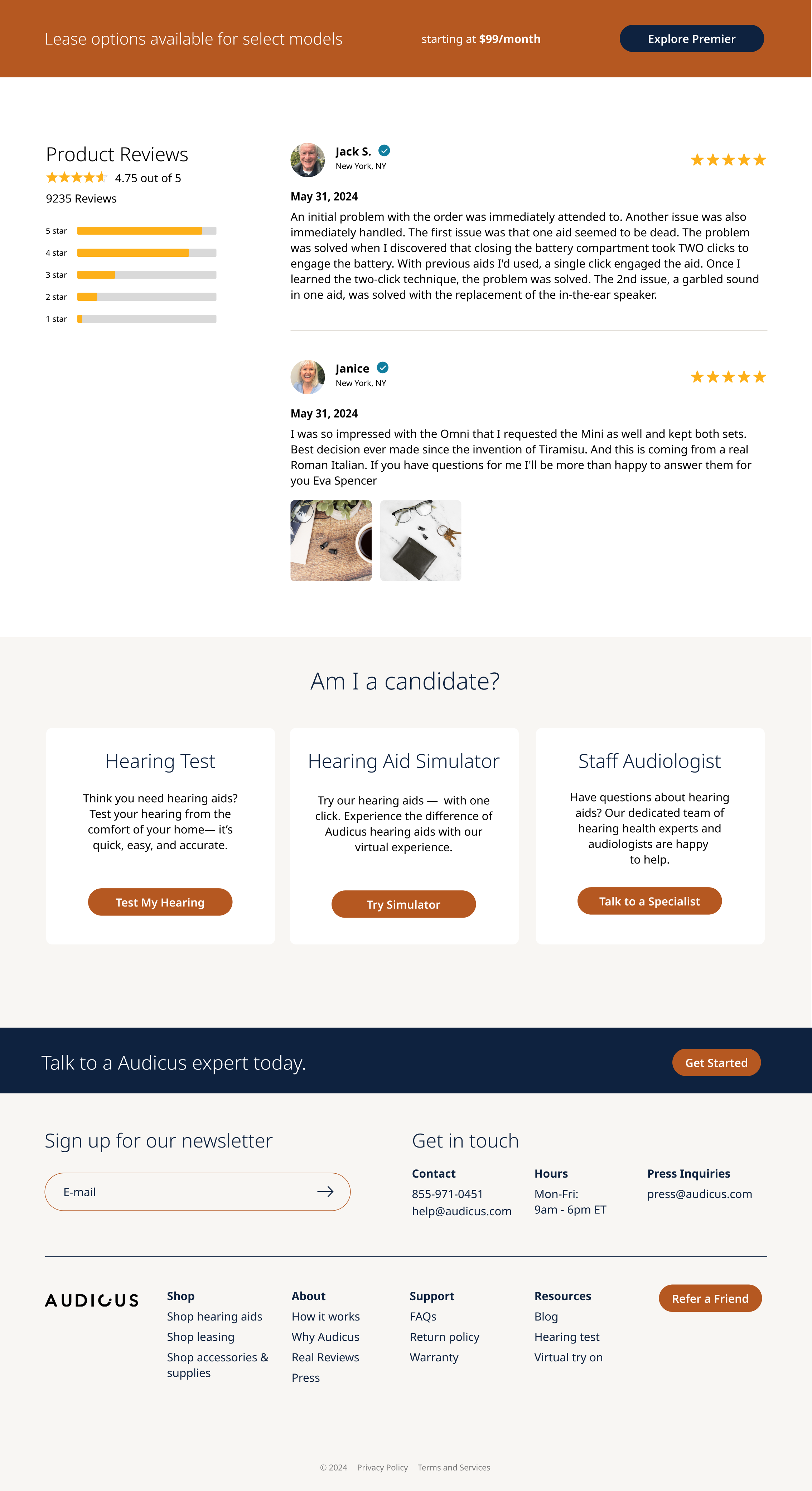
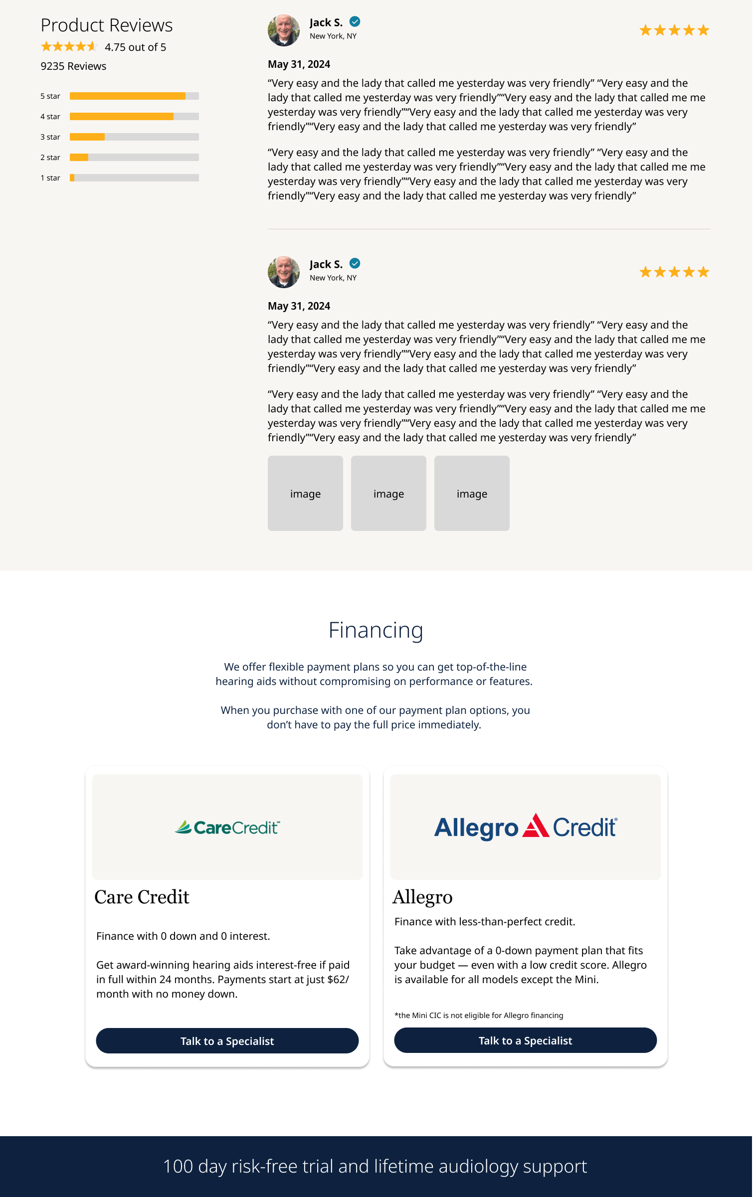
Dont trust us? read the reviews
At the time that I was brought on, we were seeing reviews that people thought we were a scam. When redesigning, I really wanted to emphasize real reviews with real people. Although this wasn’t a product issue, during my preemptive research, I realized our Facebook messages and posts weren’t being monitored by a team member. This caused a lot of frustration for our demographic since that is one of their main avenues and resulted in them not trusting us since we could not even answer their questions on their chosen platform.
PRODUCT PAGE
The old product page required seven selections to add to cart:
pair or single
color
remote vs no remote
rechargeable vs battery
partner mic vs no partner mix
care and protect vs no care and protect
warranty vs no warranty
then finally, add to cart
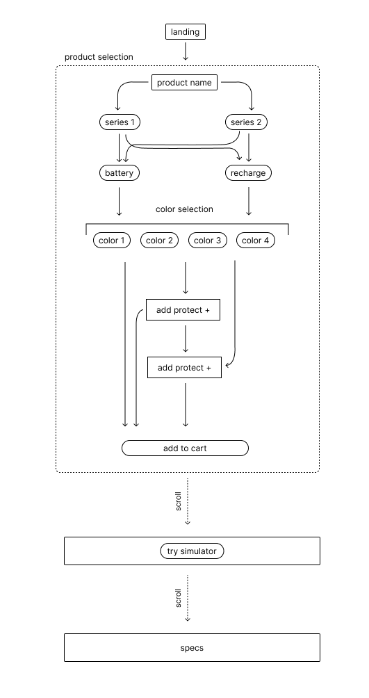
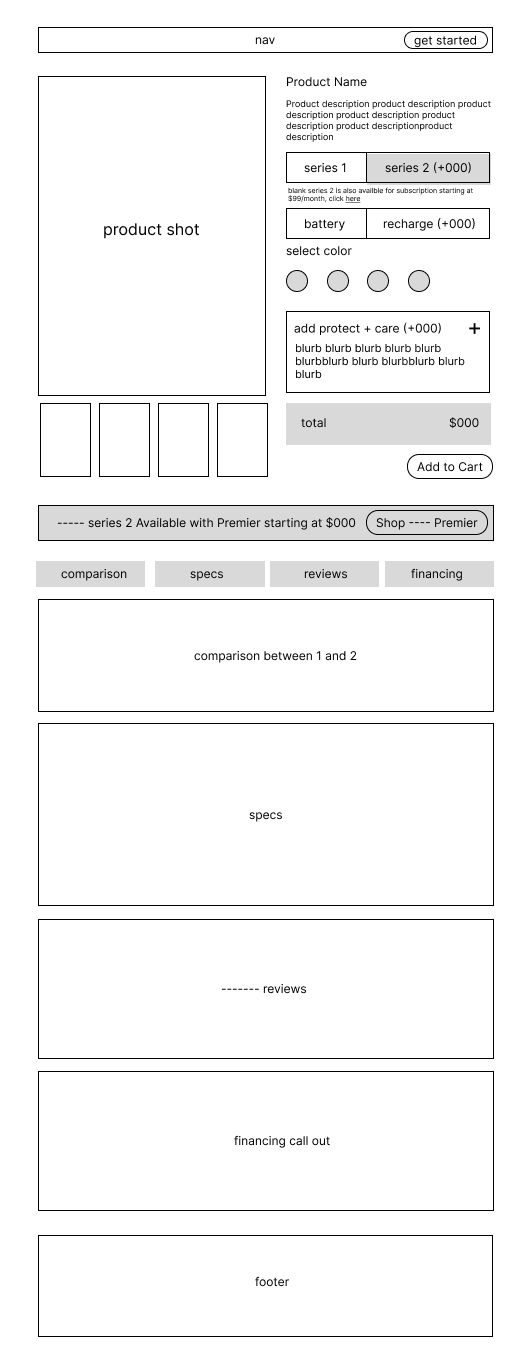
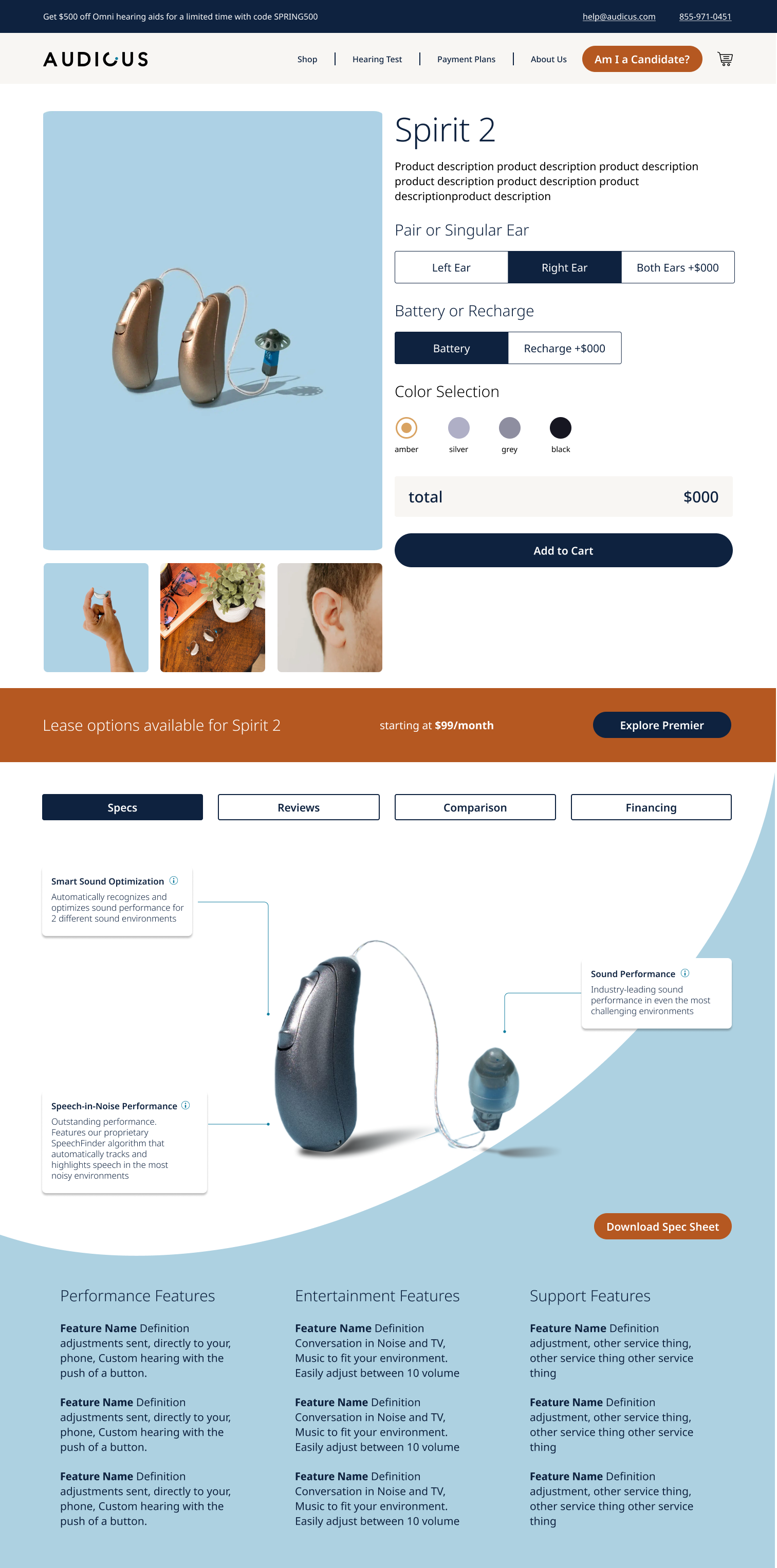
This was way too much to ask of a user. We were able to simplify it down to 3 selections:
pair vs single (I tried to eradicate this selection but lost the war)
rechargeable
color selection
We were able to strip down the selection and eliminate unneeded friction to checkout and as a result saw 20% less calls to complete checkout.
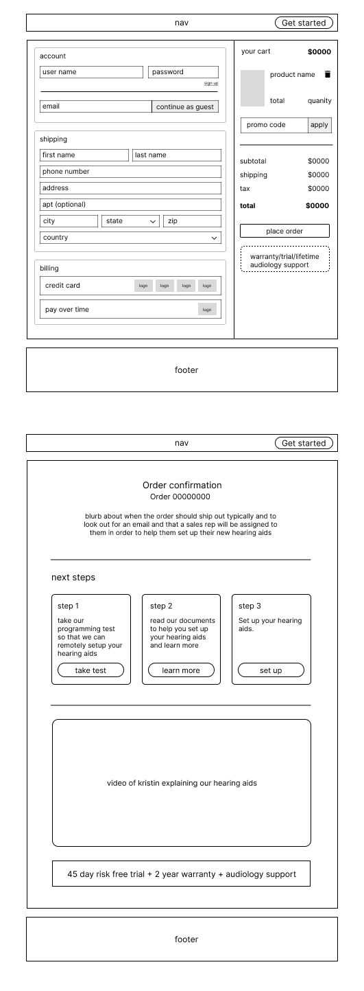
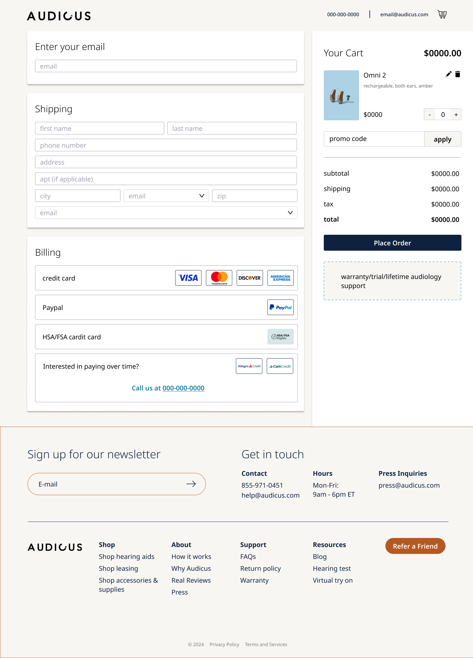
CHECKOUT
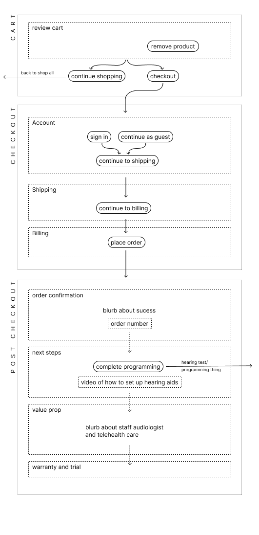
In full transparency, checkout is still a problem we are trying to nail down. Without a full dev team, we are slightly limited to what other platforms can help us with and since we are buy upfront and subscription, we have struggled to find a platform that works well with our current product lineup.
Since we are already overloading the user with so much information, I attempted to use a platform that resembles sites that they already interact with in order to eliminate any confusion on the home stretch.
When it comes to checkout, there is really no reason to recreate the wheel. The only thing I wanted to add to checkout, since I stripped it away from the product page, was the option to add our “care and protect” and our warranty.
As a designer, I have the benefit of allowing this to be an option at the end. Since after all, this may the biggest purchase of our customers year.
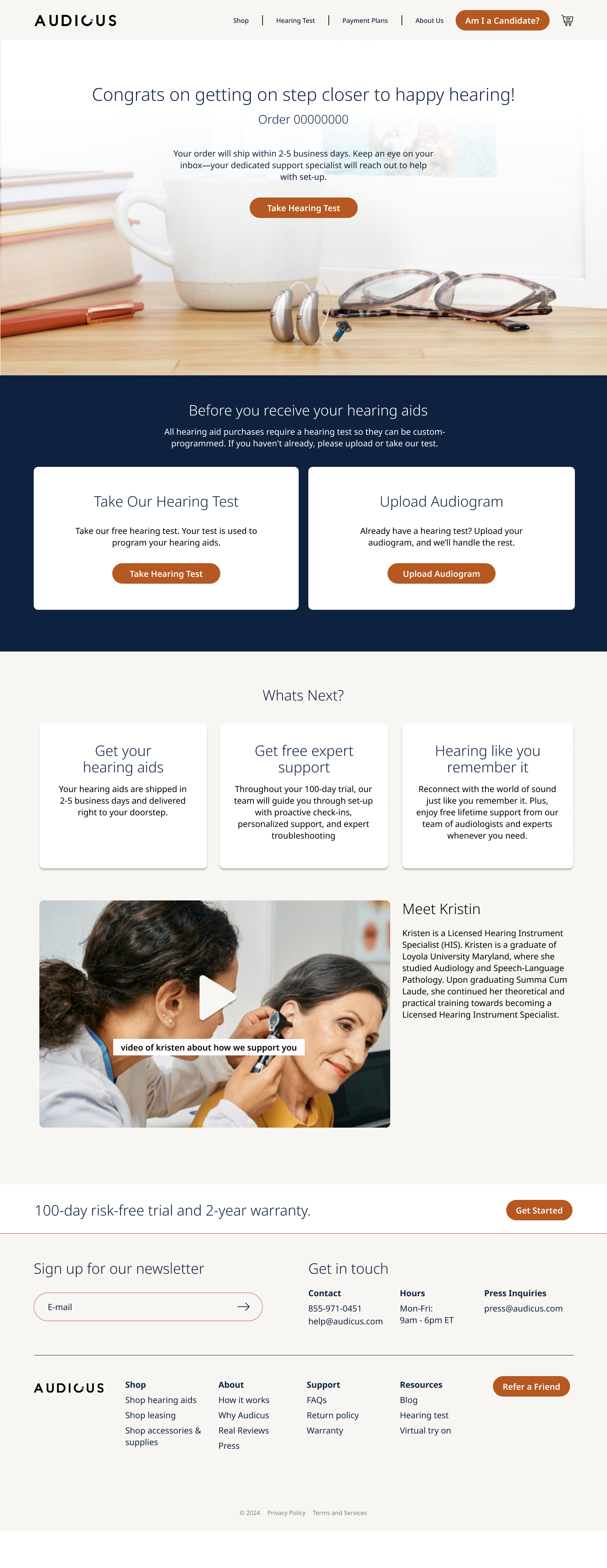
Our post purchase objective is fairly simple, ensure the user takes the hearing test. But we can’t just force them into the exam or to upload their hearing test, we needed to tell them why and how it works. This demographic are big researchers and like to know the ins and outs of the product and the system.
The Results
As quickly as 2 months post launch:
We saw an increase in self checkouts
Sales had a million dollar sales month for the first in Audicus history
We started receiving positive reviews about our web experience.
Although I didn’t achieve as much as I wanted to on this project, I do think it had a positive impact on the company and it was the right decision to push the project forward.
The project is ongoing, we still need to crack checkout and finally flush out user accounts which has been banished to the backlog for the past few months.
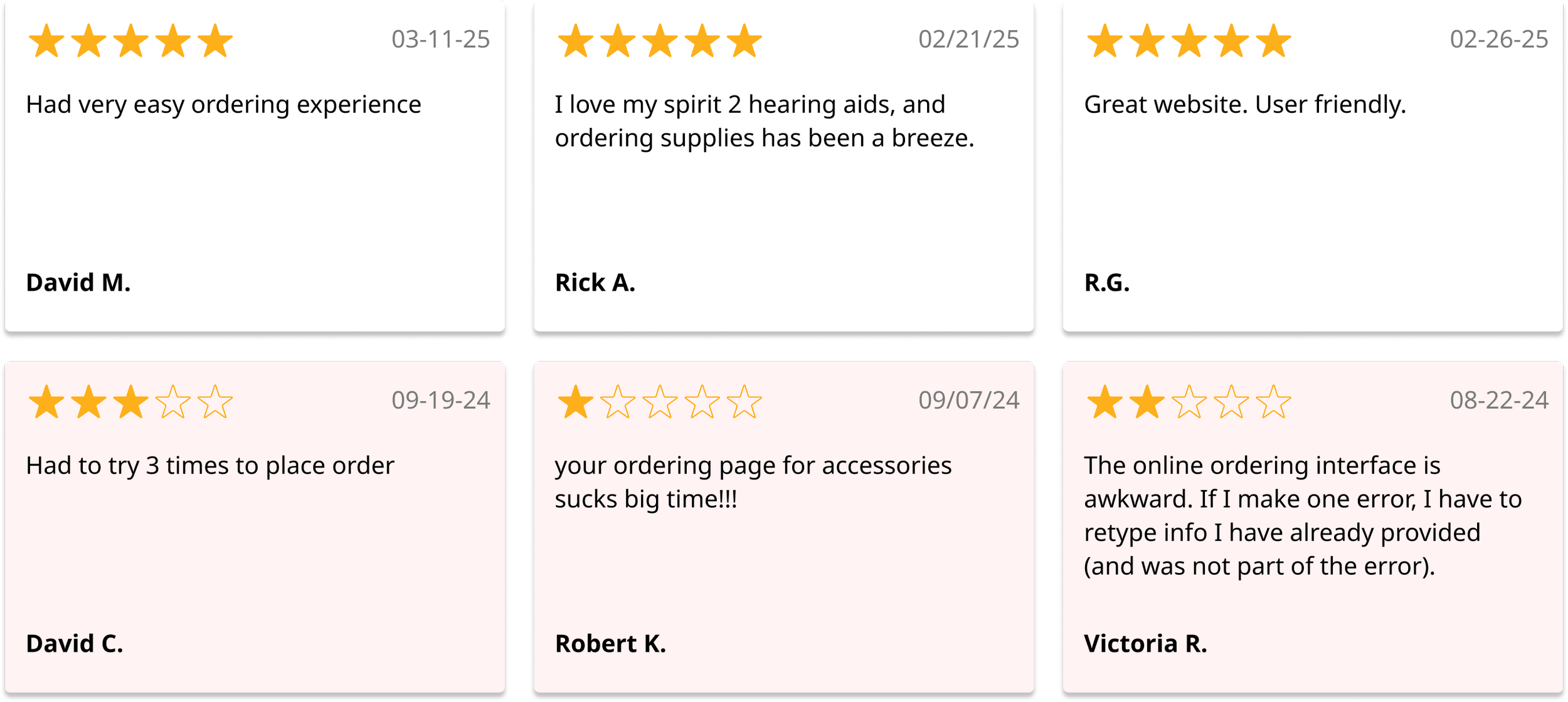
Comparing the reviews from prelaunch (October 2024) has been a great indicator for me that we made some good choices and gave people some autonomy to order on their own